ICON愛康
ICON愛康
Identity for Taiwan home-grown sanitary pads
-
Client
愛康 ICON
-
Team
Jackson Tan
Soh Kah Khee
Illy Lin
Dahlia Loren
Annie Wu
-
Client
愛康 ICON
-
Team
Jackson Tan
Soh Kah Khee
Illy Lin
Dahlia Loren
Annie Wu
ICON愛康is a sanitary pad company founded in Taiwan in 2007, with the mission to bring about greater care and comfort during menstrual cycles. Their innovation in sanitary pad development introduced cooling sanitary pads to the Taiwanese market and they continued to innovate and develop menstrual products for consumers of different ages. As icon moves from e-commerce platforms to off-the-shelf retailers saturated by their competitors, a new and fresh visual approach is needed.
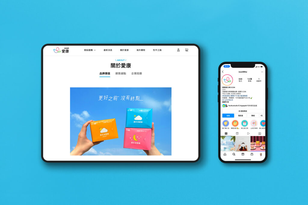
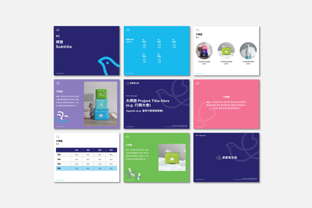
BLACK was commissioned to define a brand system for icon and its biotech development arm, and develop a refreshed identity to distinguish it and set it apart from its competitors. This includes a family of product lines, and encompasses both cooling, non-cooling and hygiene products.
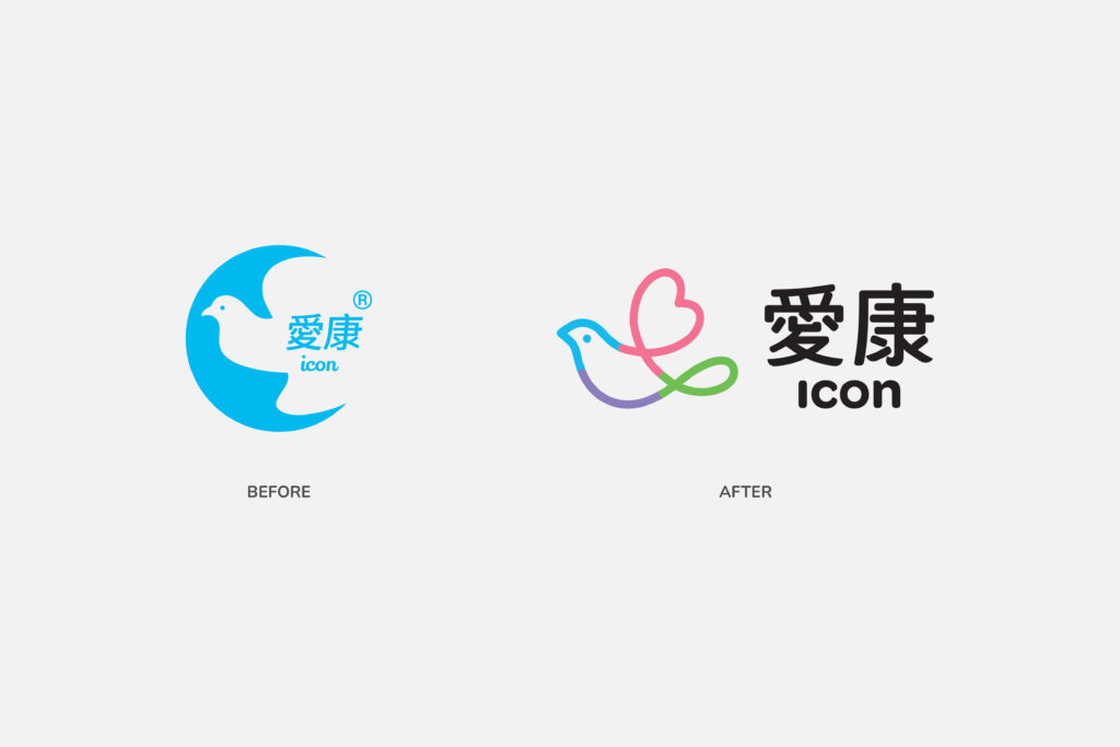
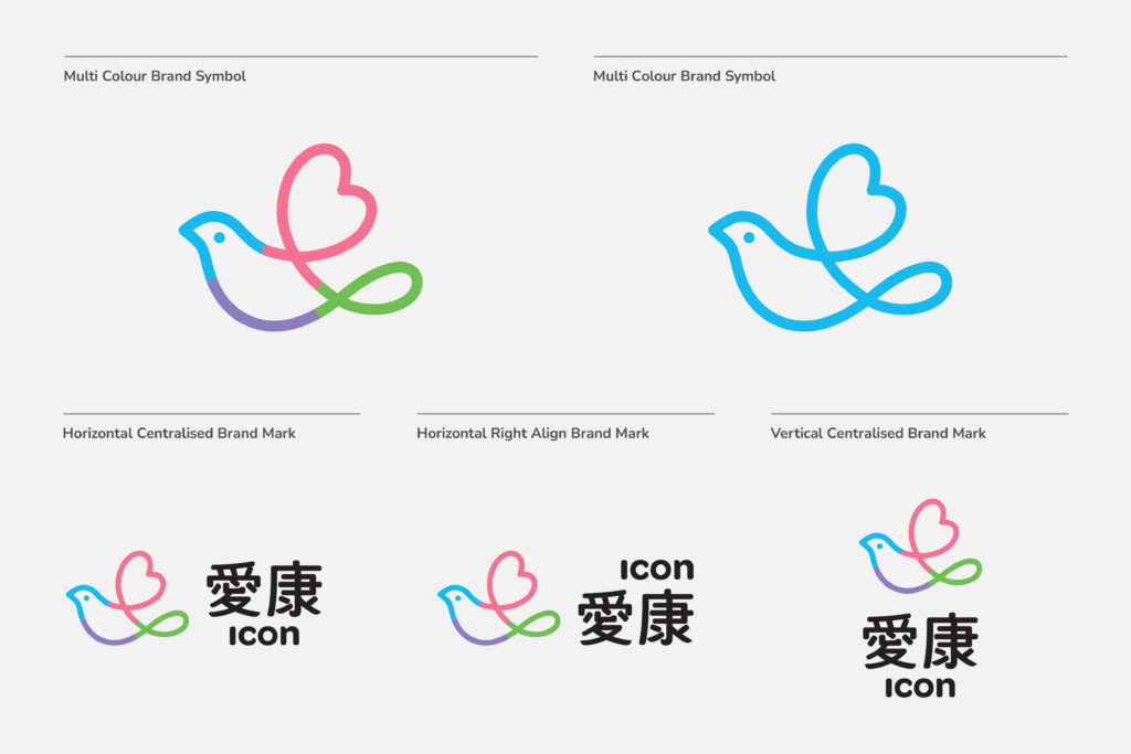
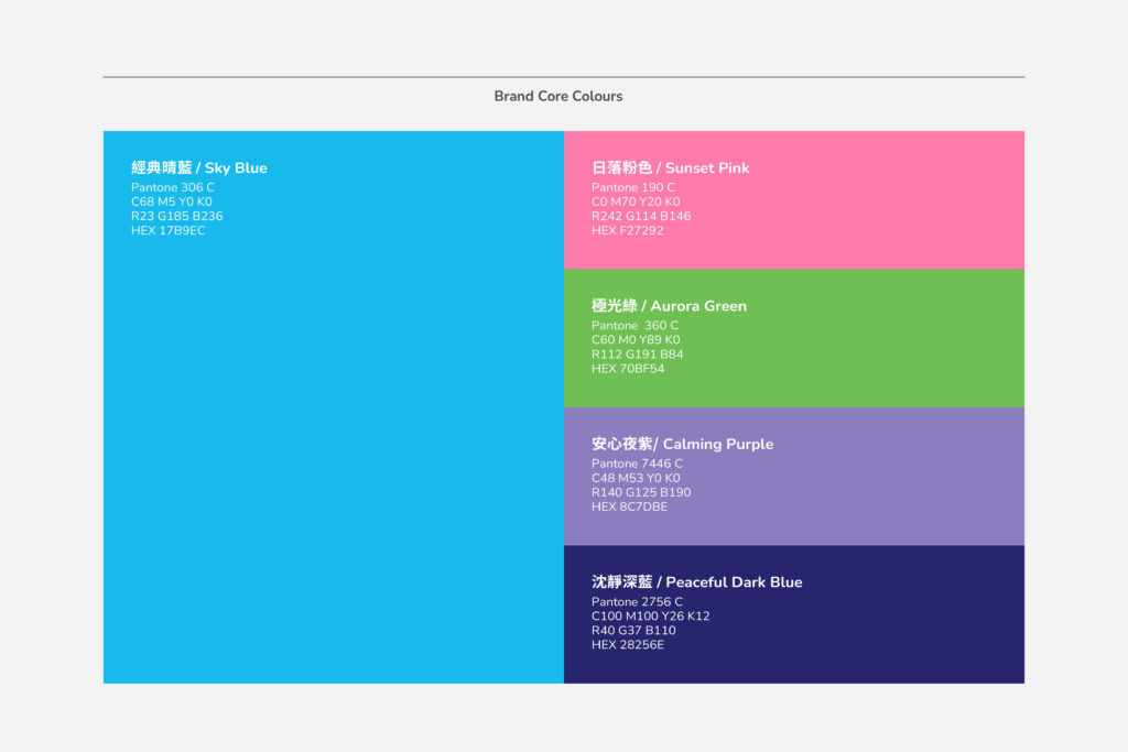
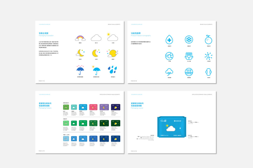
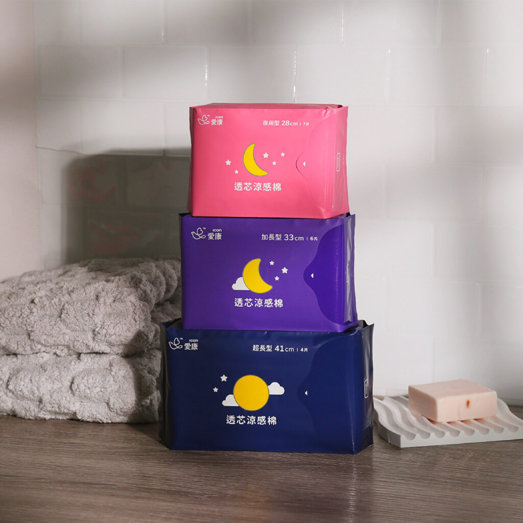
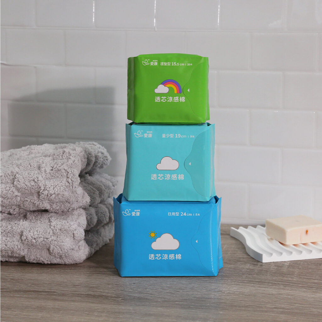
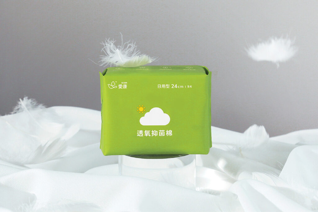
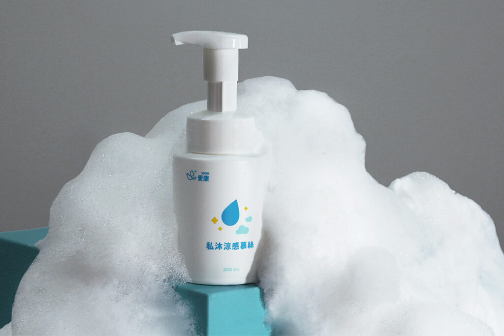
The dove symbol was retained for brand recognition and combined with a heart that symbolises care. The existing colour scheme was expanded to include colours for future product lines. A fresh set of weather-based illustrations as well as functional icons was designed to differentiate between sanitary pads of different sizes and functions. Elements of the logo was extracted and transformed into secondary graphics that can be applied to a variety of collaterals.
Read More + Go Back -
