Bengawan Solo Singapore
Building a Heritage Brand for the Future
Logo refresh for Singapore's household brand of traditional cakes and kueh
-
Client
Bengawan Solo
-
Team
Jackson Tan
Lee Xinying
-
Client
Bengawan Solo
-
Team
Jackson Tan
Lee Xinying
Bengawan Solo is a brand of traditional cakes and kueh made and distributed in Singapore. Since it was established more than 40 years ago, it has become synonymous with quality ingredients and time-honoured methods of preparation, turning into a household name for Southeast Asian confectionery.
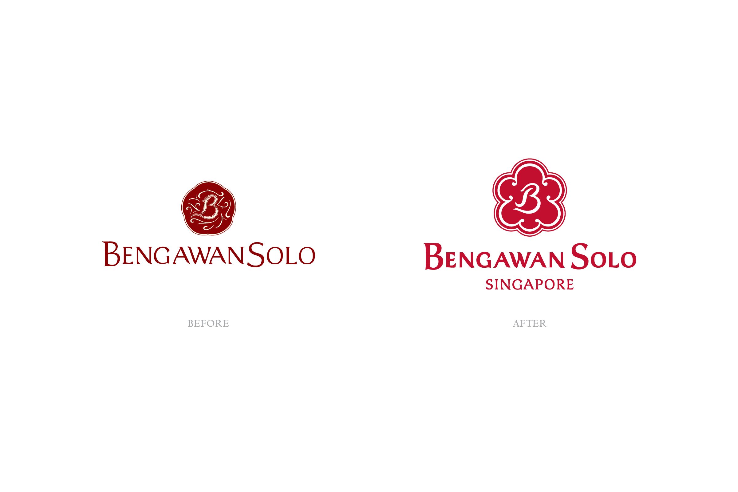
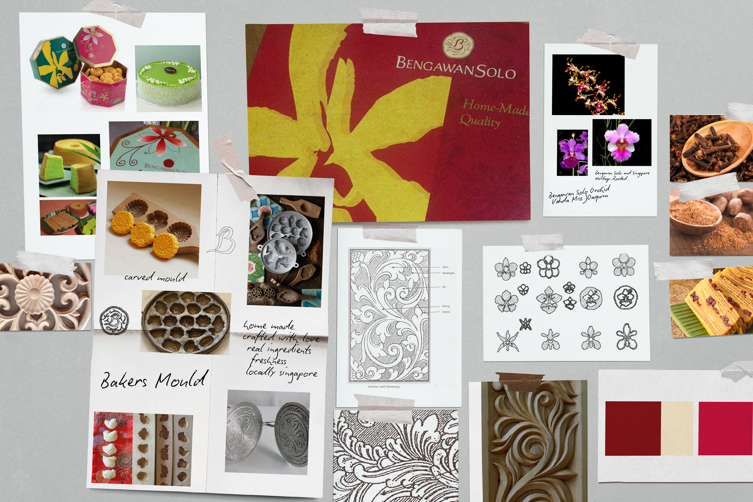
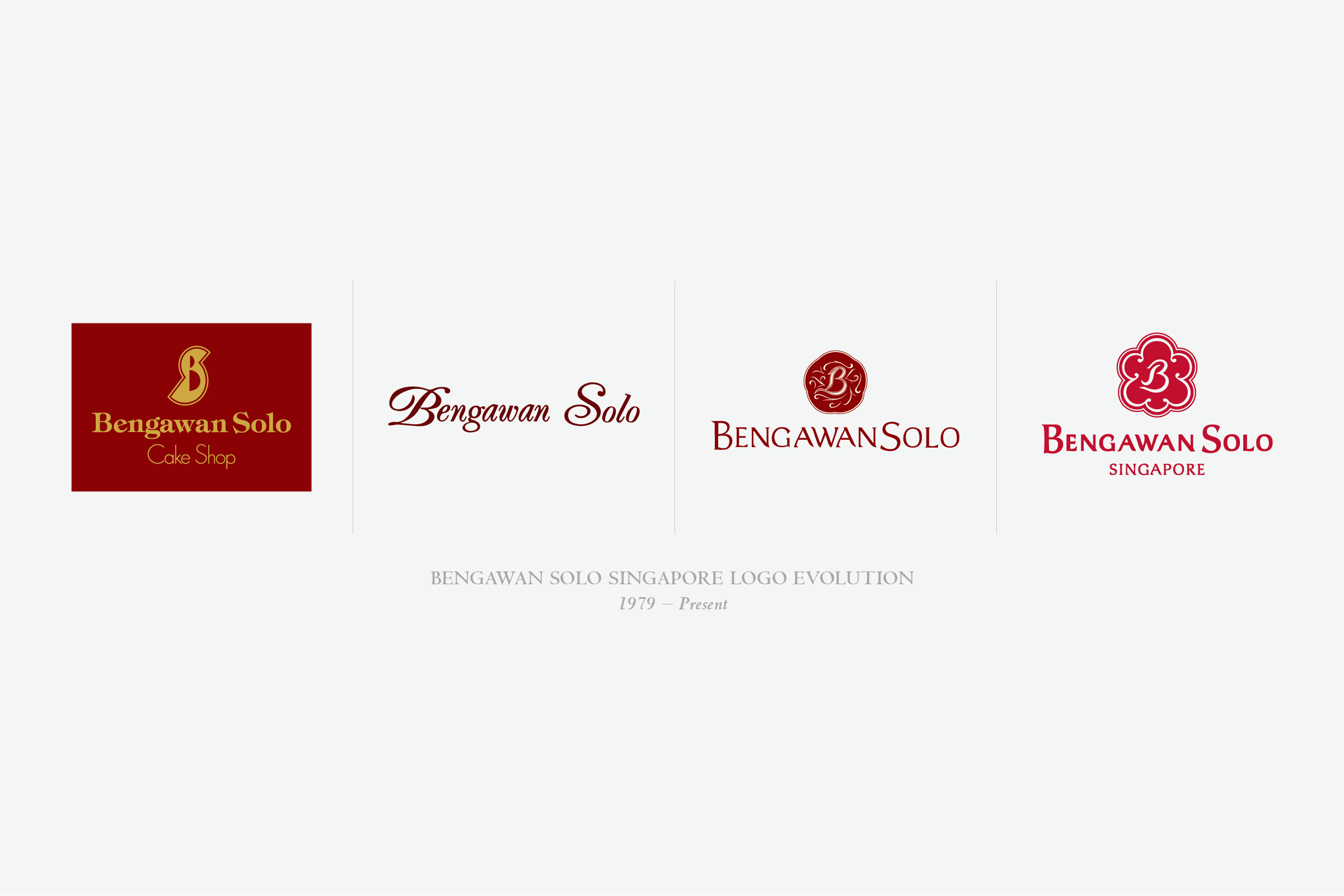
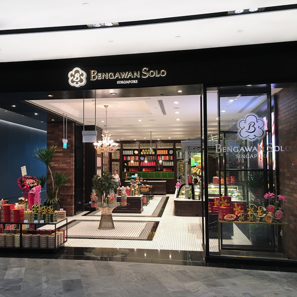
In looking towards the future, a brand refresh was undertaken to reinforce Bengawan Solo’s distinctively Singaporean identity, as well as to develop brand infrastructure that could be implemented across a contemporary range of applications. The first objective was achieved through the addition of “Singapore” into the word mark. This helped to distinguish the brand from its name’s traditionally Indonesian roots, while strengthening its appeal to both local and international consumers. The brand symbol—the Baker’s Mark of Bengawan Solo—was reinterpreted to combine elements from both the original symbol, as well as the orchid, Singapore’s national flower.
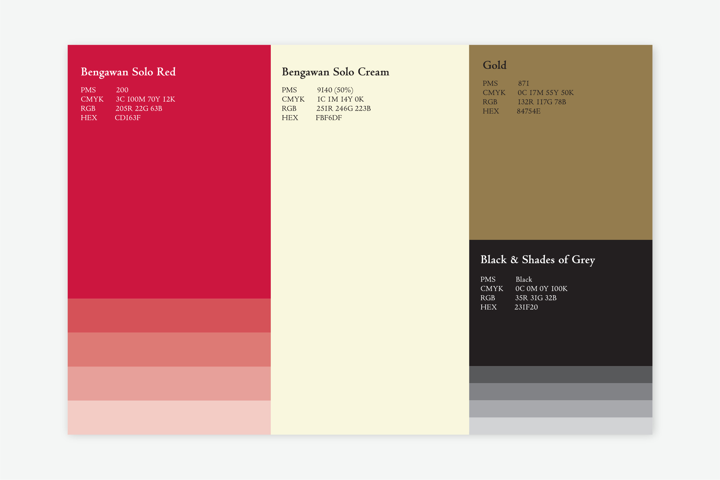
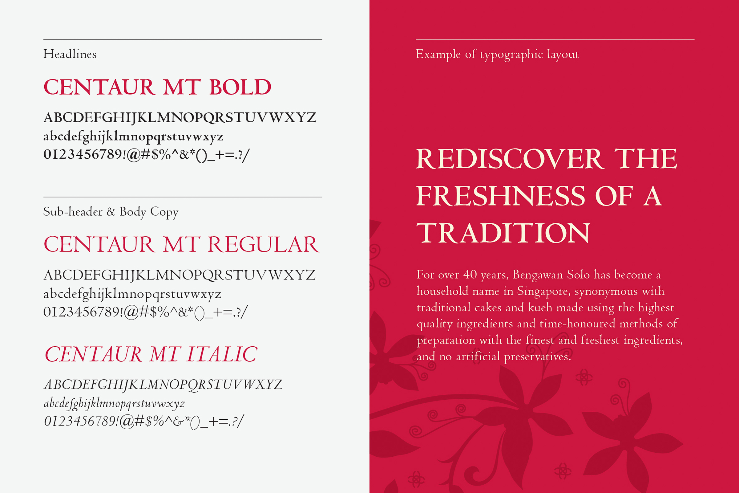
A brighter brand colour palette inspired by the ingredients and flavours of Bengawan Solo was also introduced. Put together, the complete brand mark highlights Bengawan Solo’s heritage and evolution as a homegrown brand, while conveying modernity and clarity.
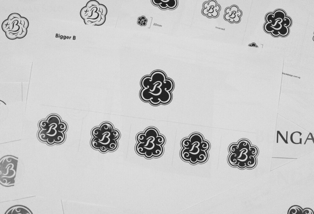
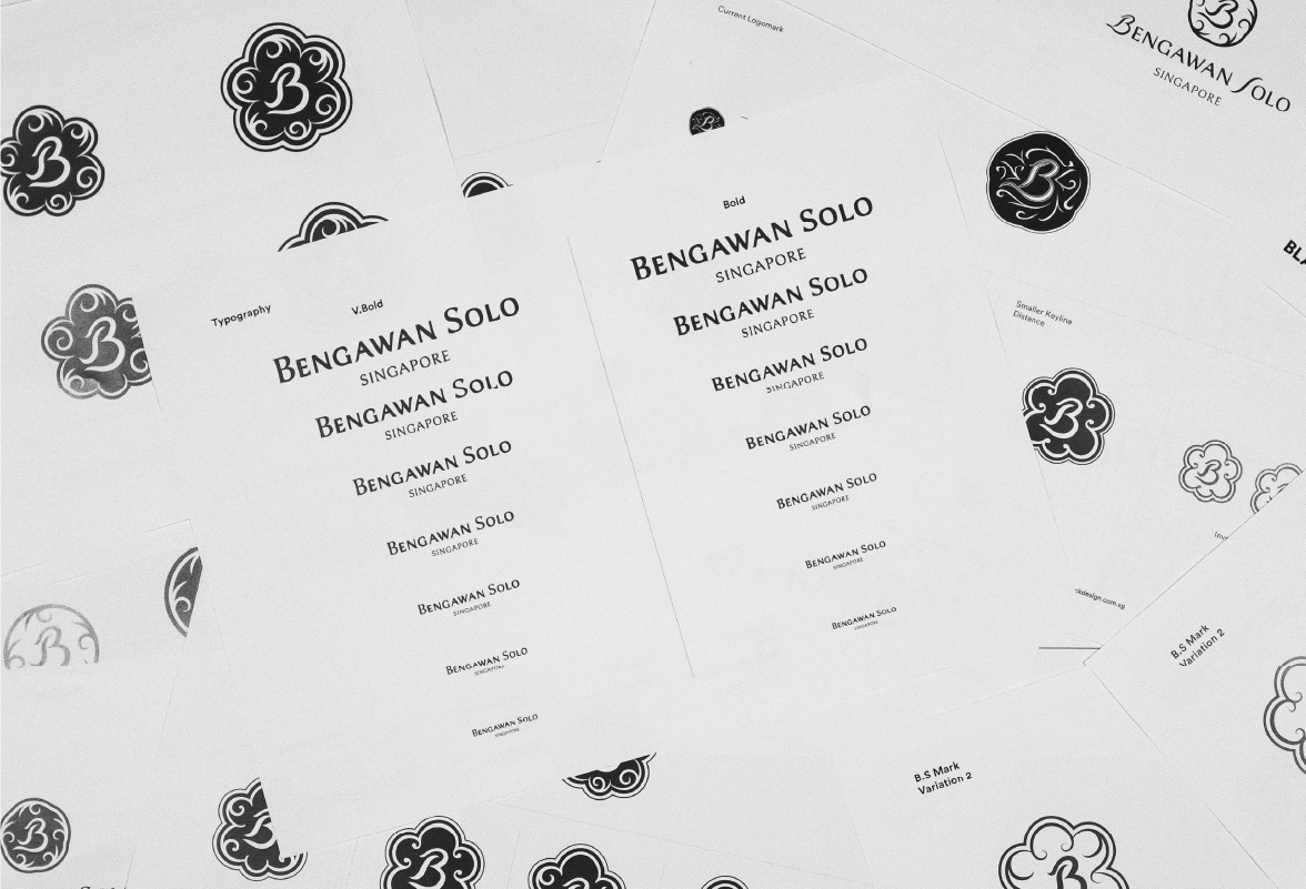
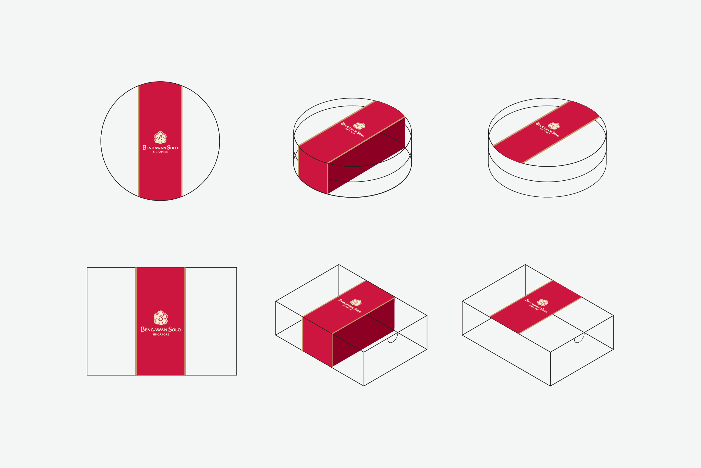
In response to the second objective, the brand mark was designed to be easily reconfigured to suit various applications. It is also optimised for legibility on digital platforms as well as smaller signage spaces, allowing for adaptability in a modern retail climate.
Read More + Go Back -

