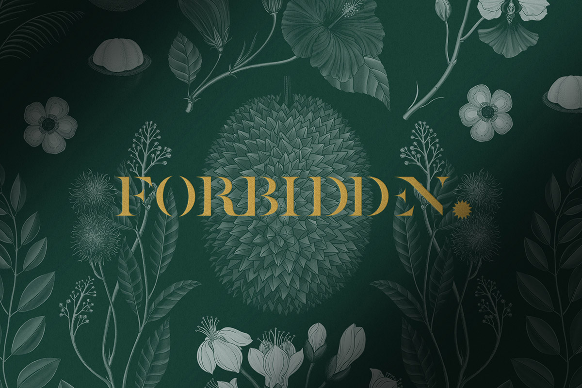
Forbidden
The King of Fruits: Farm to Forbidden
Branding, packaging and product design befitting the durian’s status as the King of Fruits
-
Client
Sunny Food Labs SDN Bhd
-
Team
Jackson Tan
Justin Chan
Lee Xinying -
Collaborators
-
Client
Sunny Food Labs SDN Bhd
-
Team
Jackson Tan
Justin Chan
Lee Xinying -
Collaborators
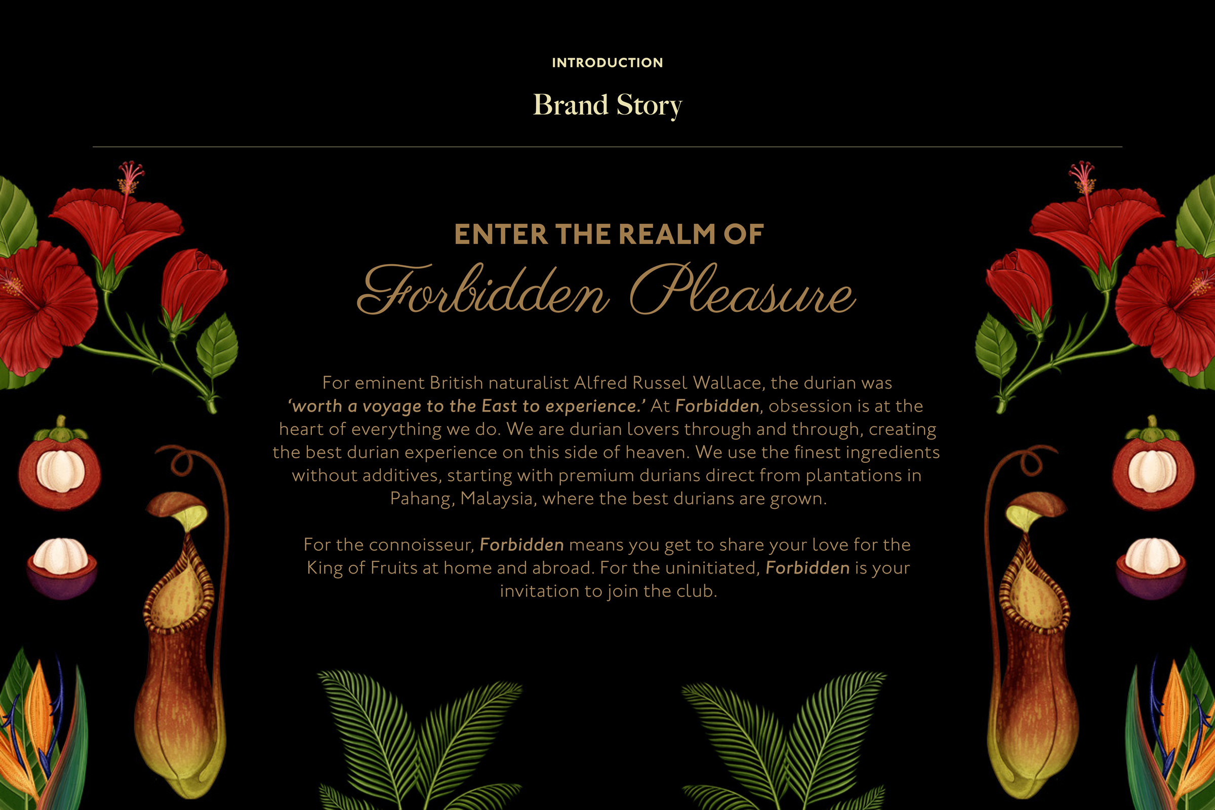
Forbidden is a brand of durian treats that was built upon the desire to craft an elevated experience for durian lovers. It assembles a multinational team of chefs, farmers, and designers, and combines their expertise with technology from SunnyHills to bring the flavours of the fruit around the world.
Created as part of the SunnyHills World Project, Forbidden embodies many of the Project’s philosophies: honouring integrity throughout the production process, consideration for the environment, prioritising the quality of raw ingredients, honesty of the final product, and craftsmanship. At the same time, it supports farmers in Malaysia by directing investments back towards the cultivation of their lands.
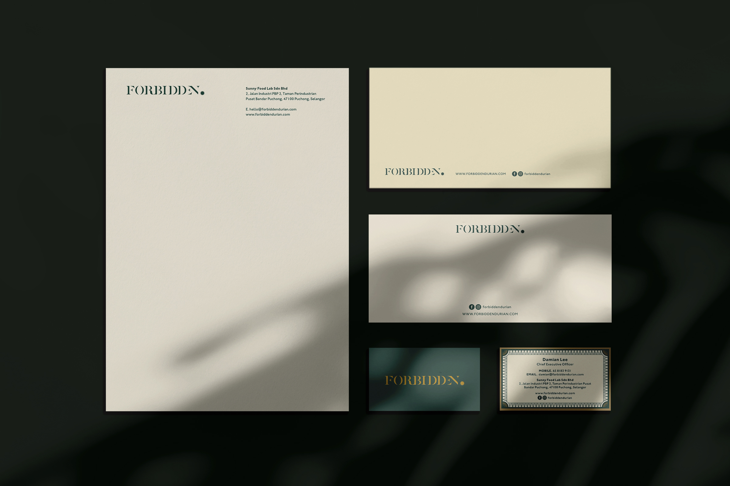
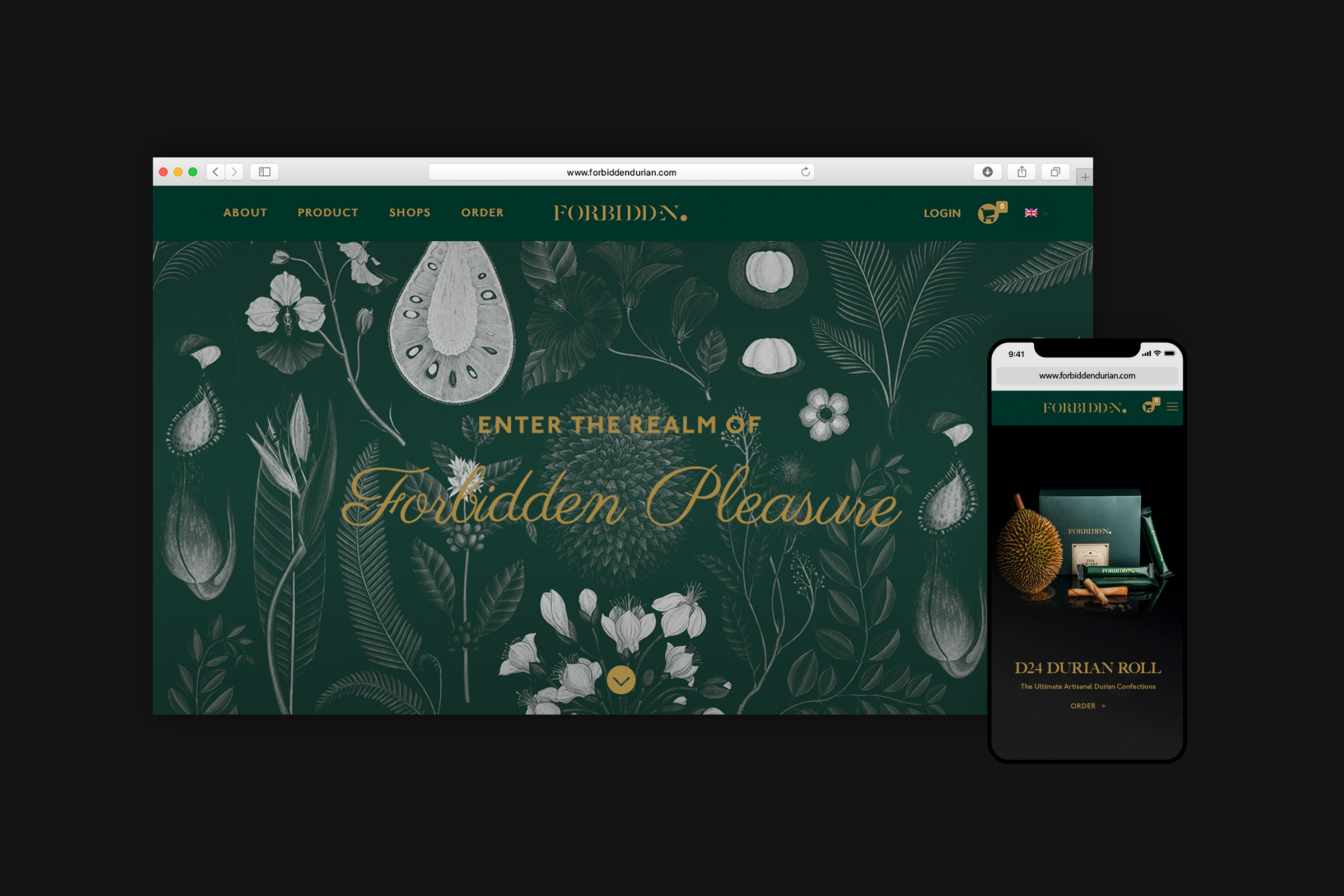
In developing the overall brand direction and strategy for Forbidden, BLACK looked into establishing a brand name and infrastructure, as well as a system of packaging and product design that would redefine and enhance the existing perception of durian products.
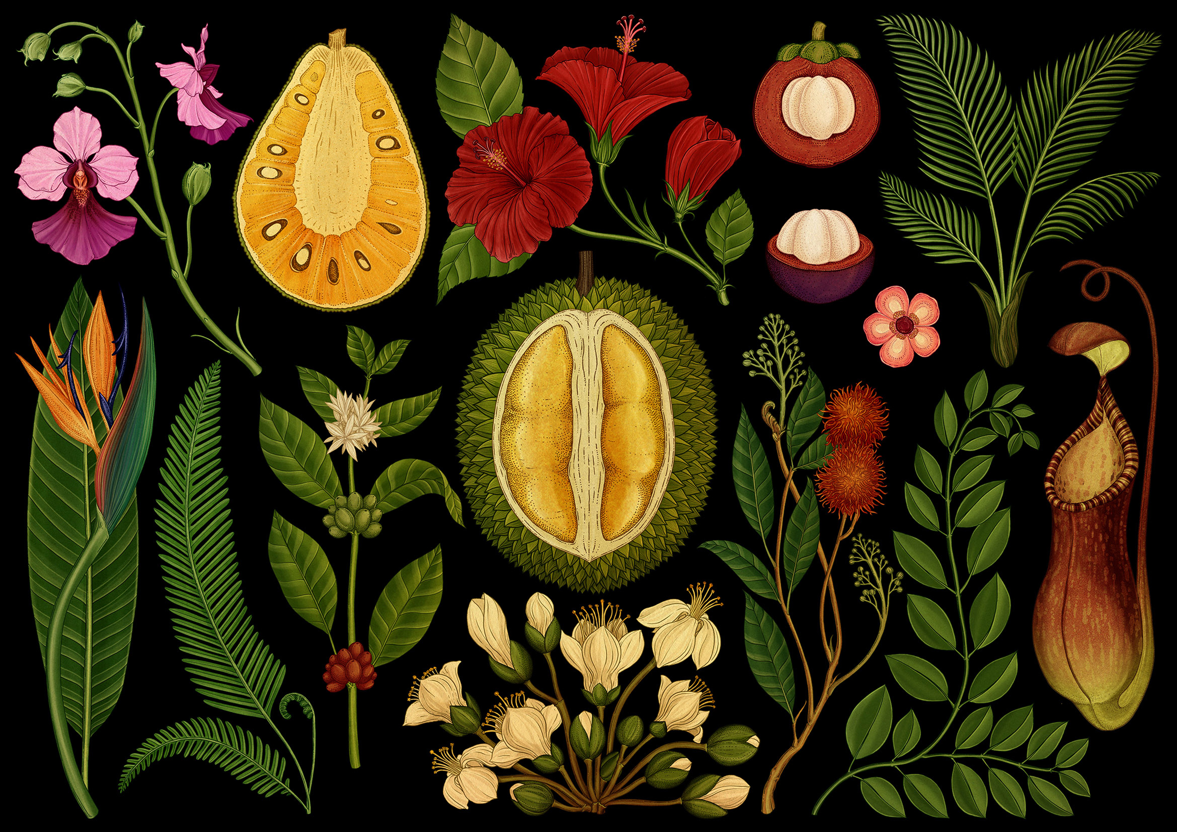
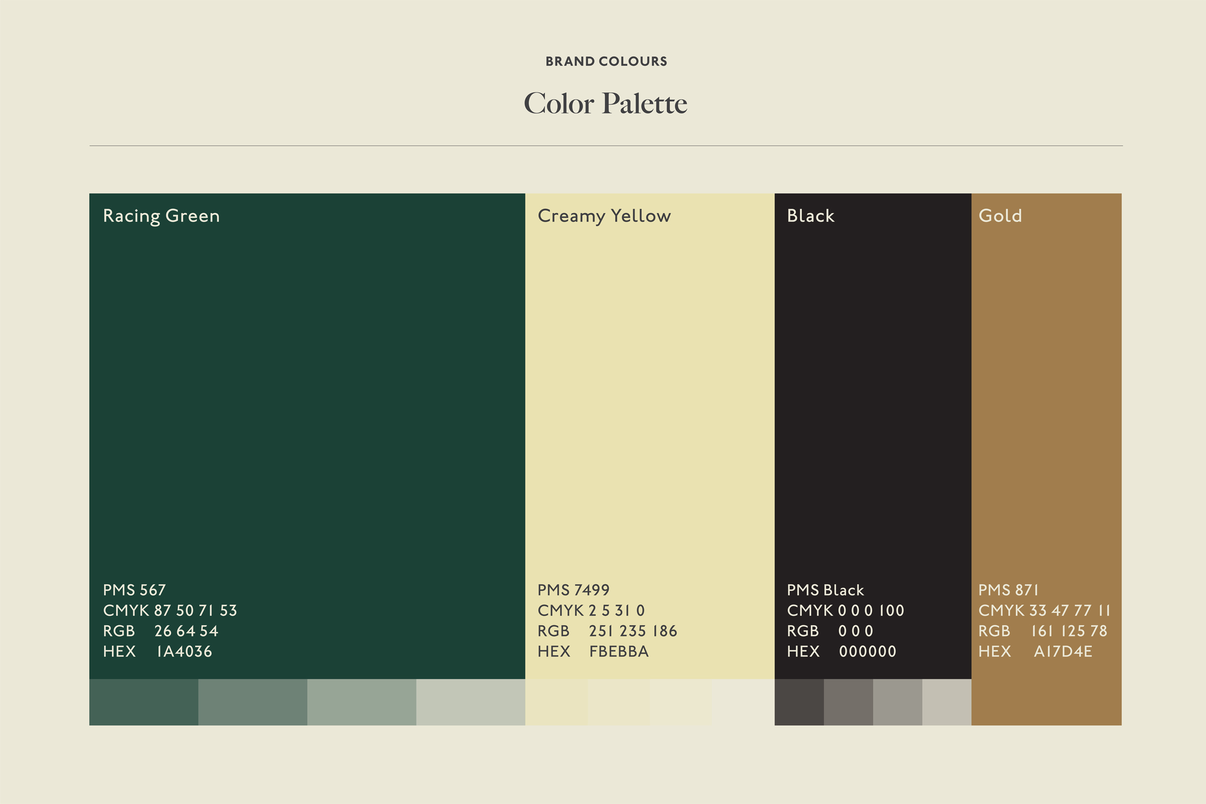
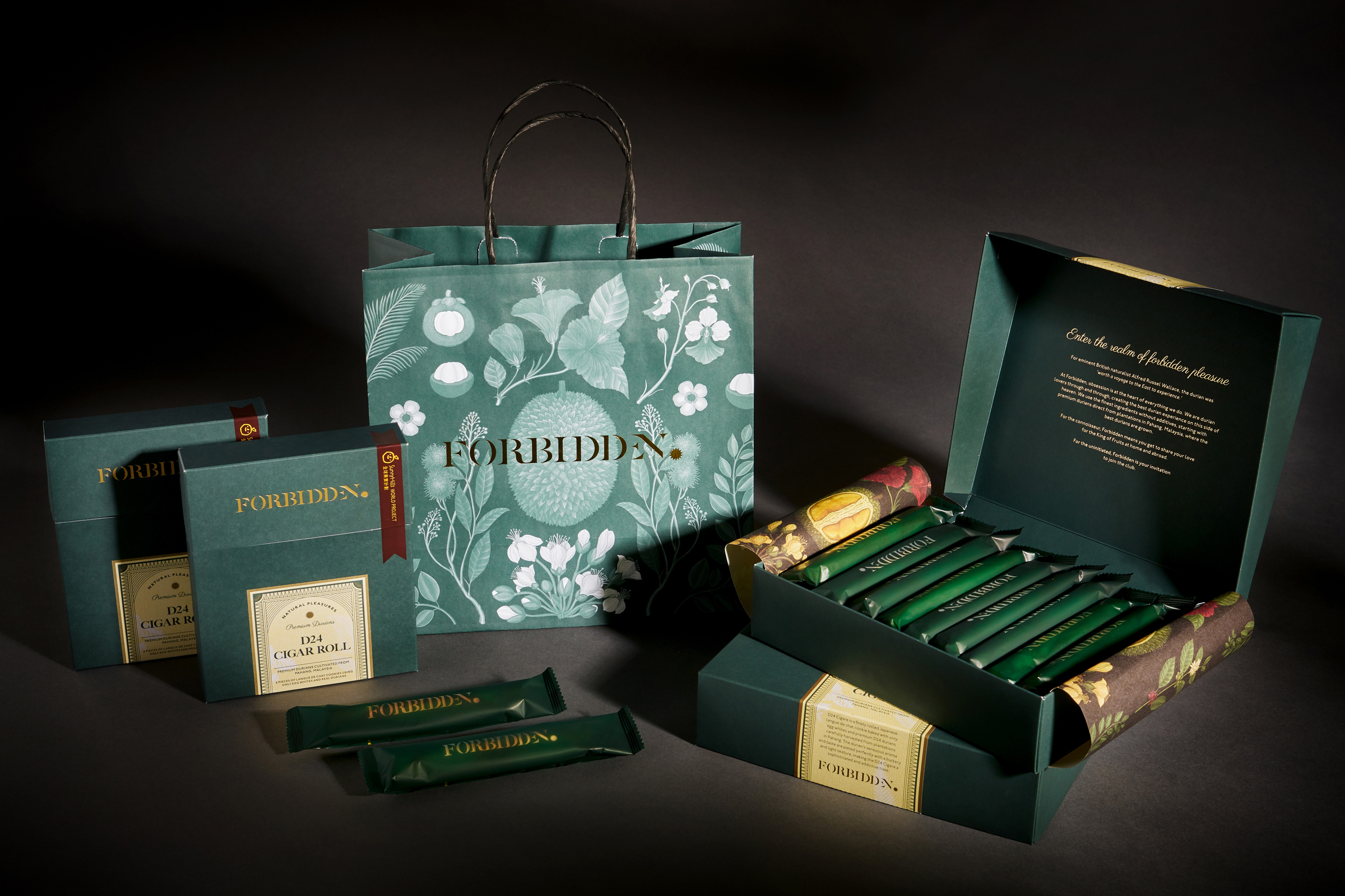
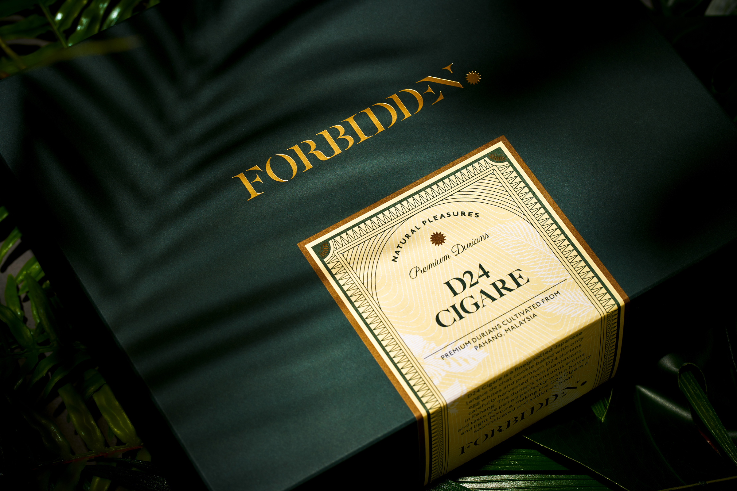
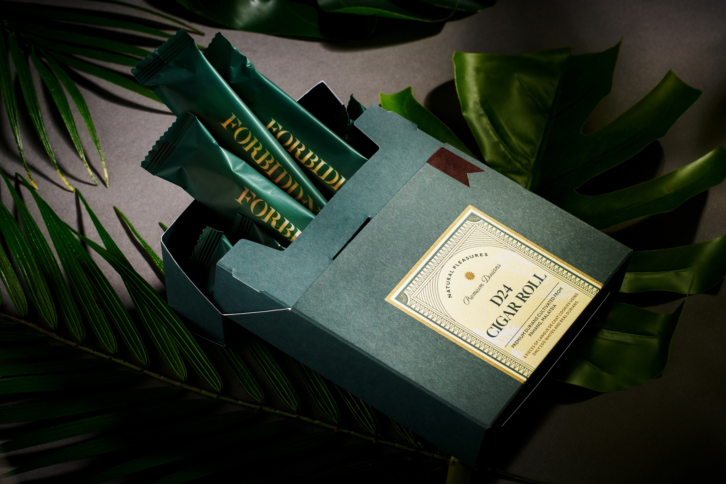
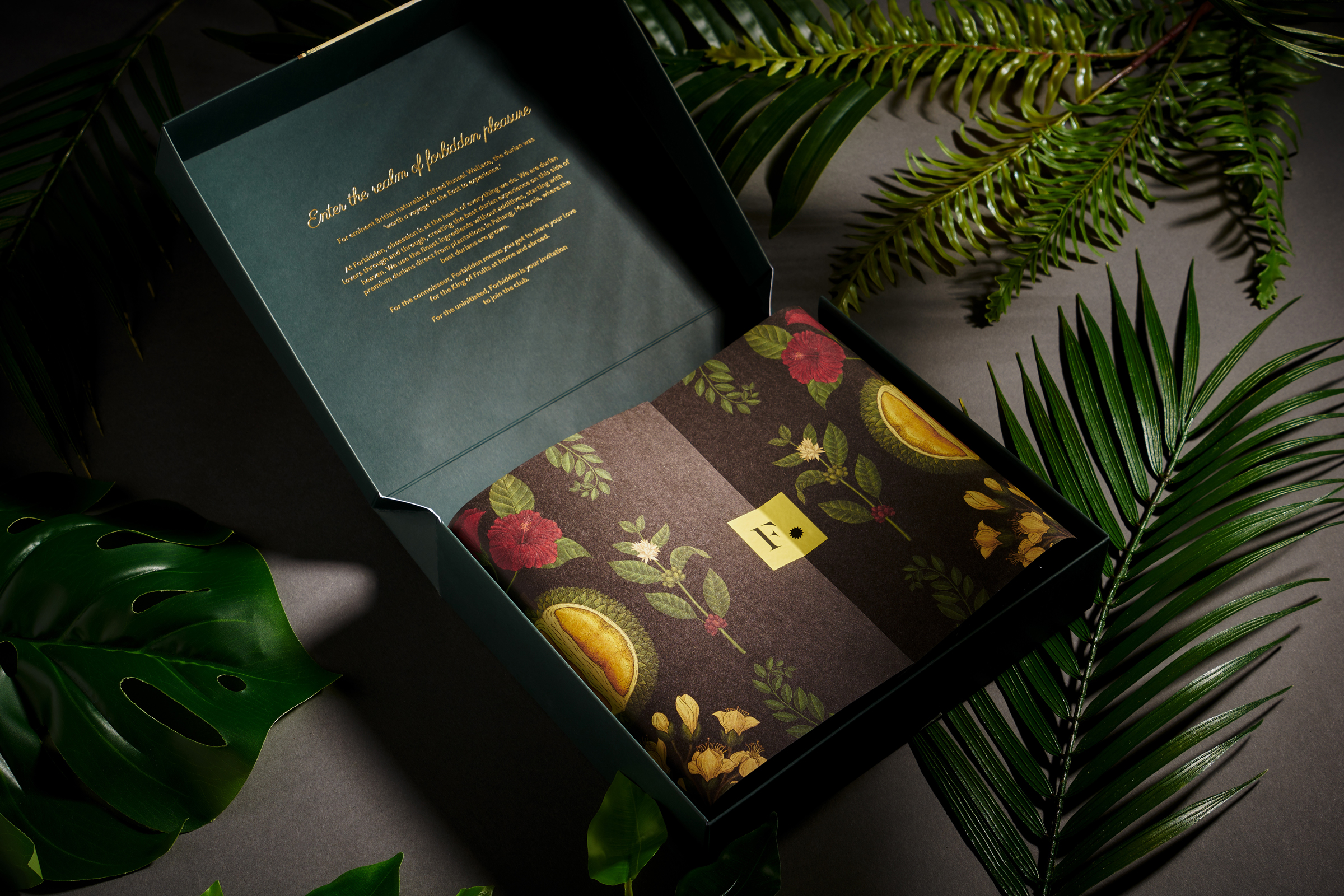
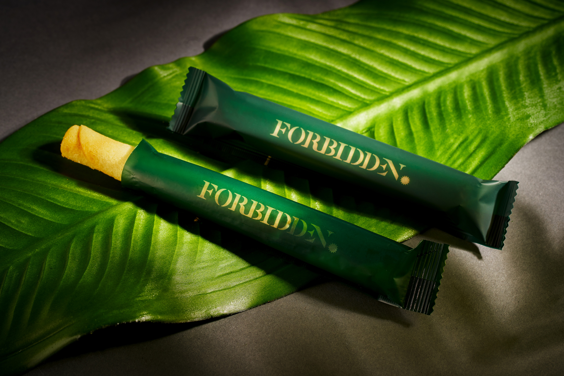
To express the sensual, almost guilty pleasure derived from eating durians, the brand mark comprises a star motif that signifies a mark of excellence. Articulated in a rich colour palette, it conveys a refined identity befitting the durian’s status as the King of Fruits. The brand’s emphasis on natural ingredients and flavours is also highlighted through a set of illustrative elements of the region’s flora, which illustrator Katie Scott was commissioned to create.
This air of indulgence carries through to the naming and packaging of Forbidden’s products: the D24 Cigare, Roulade and Crunche project a distinguished quality, while the Cigare box is inspired by classic cigar cases. A cream band along one edge of the box is reminiscent of cigar labels, and can be applied as a sticker seal to maintain freshness. Functional while evoking a sense of luxury, it is a preview to the ‘Forbidden Box’ experience—an explosion of flavours that begins with tearing open the product label.
Read More + Go Back -