SG60
SG60
Evolving our Little Red Dot, from SG50 to SG60
-
Client
MCCY Singapore
-
Team
Jackson Tan
Samantha Pang
Bryan Lim -
Collaborators
-
Client
MCCY Singapore
-
Team
Jackson Tan
Samantha Pang
Bryan Lim -
Collaborators
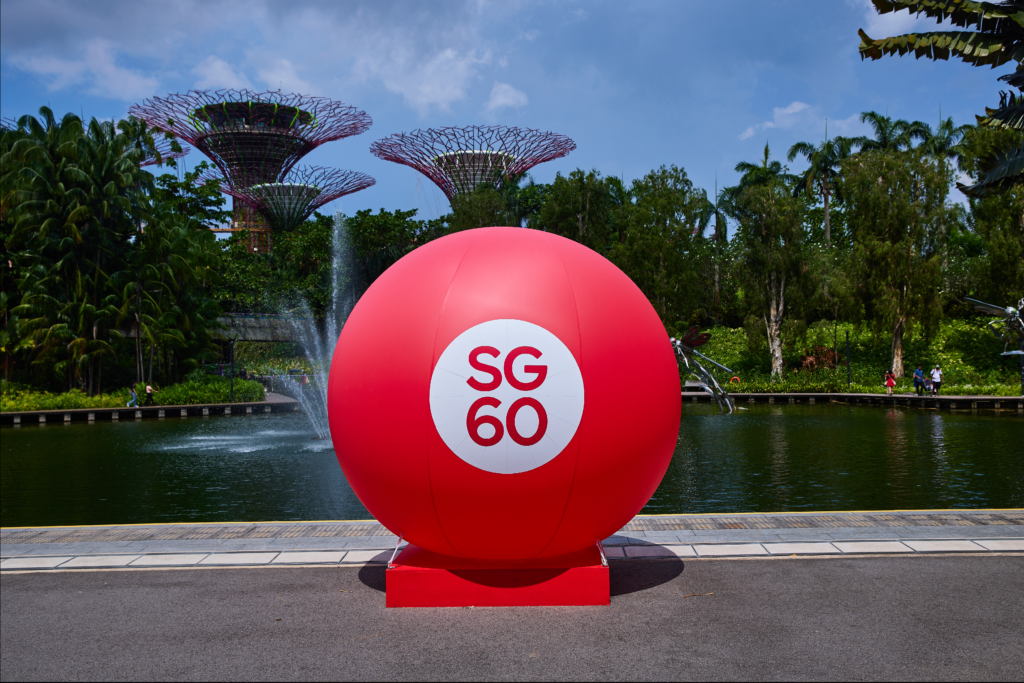
The iconic SG60 Red Dot marks six decades of nationhood – a symbol that has evolved alongside the nation itself. Since BLACK first created the SG50 logo in 2015, the design has grown through the years, from SG50 to SG Together, and now SG60.
In this latest iteration, we refreshed the typeface to enhance visual clarity and balance, while staying true to the original idea of the Little Red Dot. The logo is also brought to life through a dynamic animation — bringing our Little Red Dot from Singapore to the World.
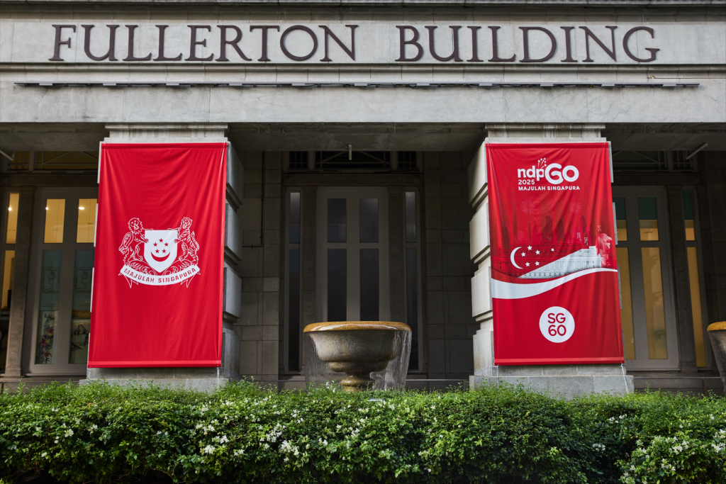
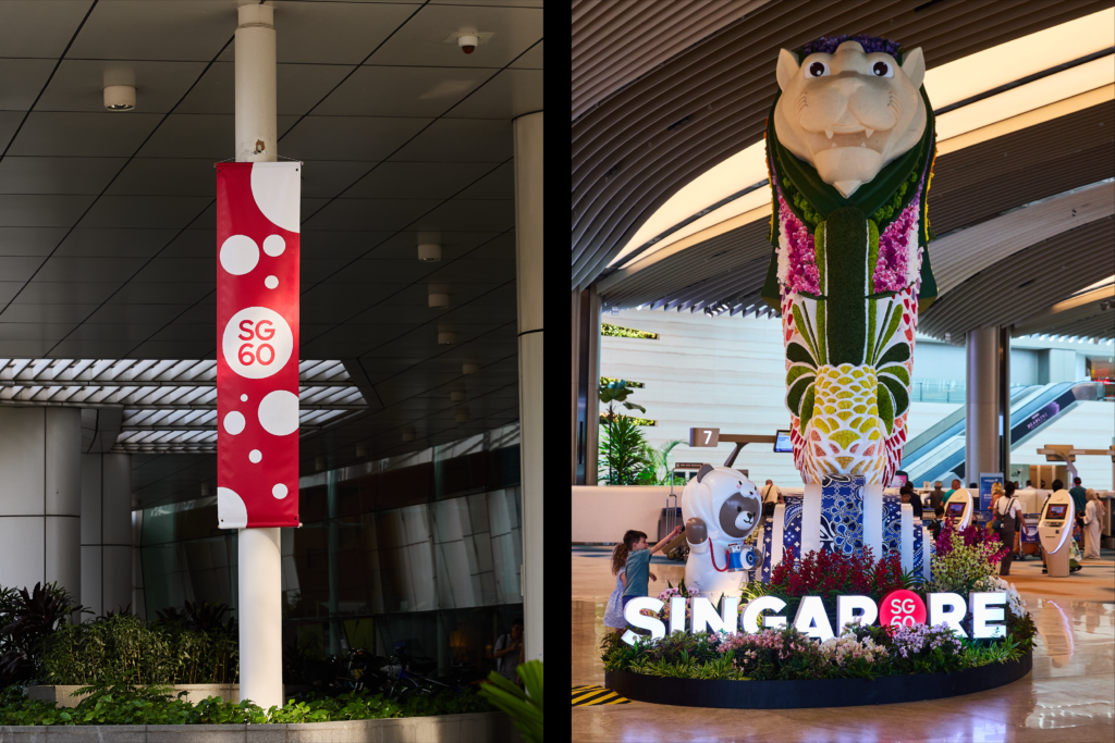
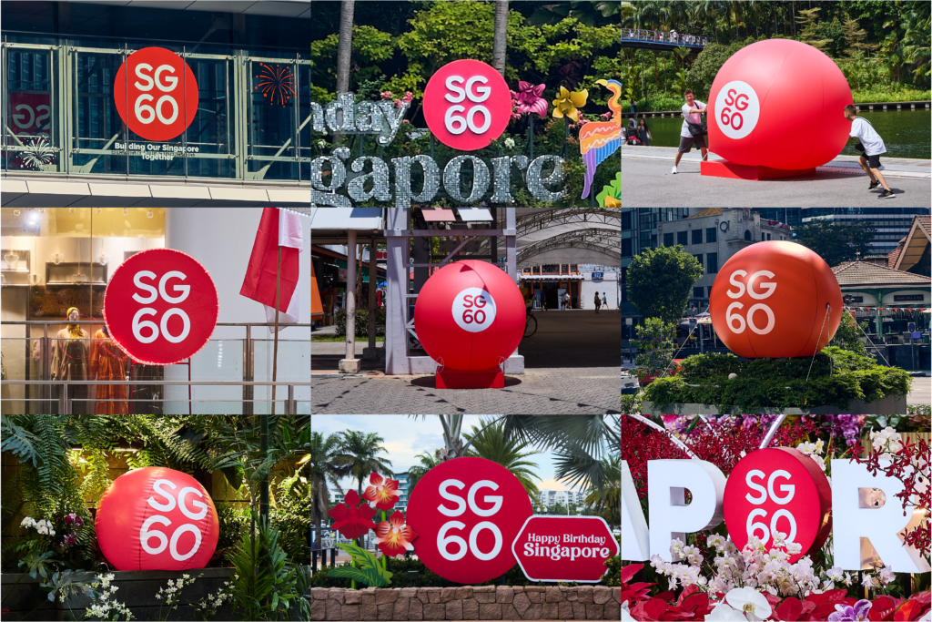
We’re proud to see the SG60 logo embraced across industries and platforms, continuing the legacy of a symbol that belongs to all Singaporeans. A huge thank you to MCCY Singapore, and Ogilvy for this collaboration.
Read More + Go Back -