Image Credits: HOPE Technik Pte Ltd
Singapore50 (SG50)
Turning weakness into strength
Celebrating 50 years of a nation with a tiny but impactful red dot
Singapore is so small that it is nothing more than a dot on the world map. This was the inspiration for the logo by BLACK to commemorate the city-state’s golden jubilee in 2015. Consisting of just the phrase “SG50” rendered in a bold white Gotham font and emblazoned in a red circle, the simple logo won a bid to become the symbol for a celebration campaign organised by the Ministry of Culture, Community and Youth (MCCY).
“One of the things Singaporeans are constantly reminded of is how small we are, our lack of resources and our precarious situation,” says BLACK’s creative director, Jackson Tan.
The “red dot” was also appropriate because it spoke of how Singapore has turned its weakness into a strength. In fact, some two decades ago, then Indonesian President B. J. Habibie called Singapore a “red dot” in comparison to the size of his country. Instead of feeling inferior, Singaporeans turned it into a term of endearment by embracing the name, the “little red dot”.
“What is cool about Singaporeans is we took it in our stride,” he says. “I thought it was time to officially call ourselves that.”
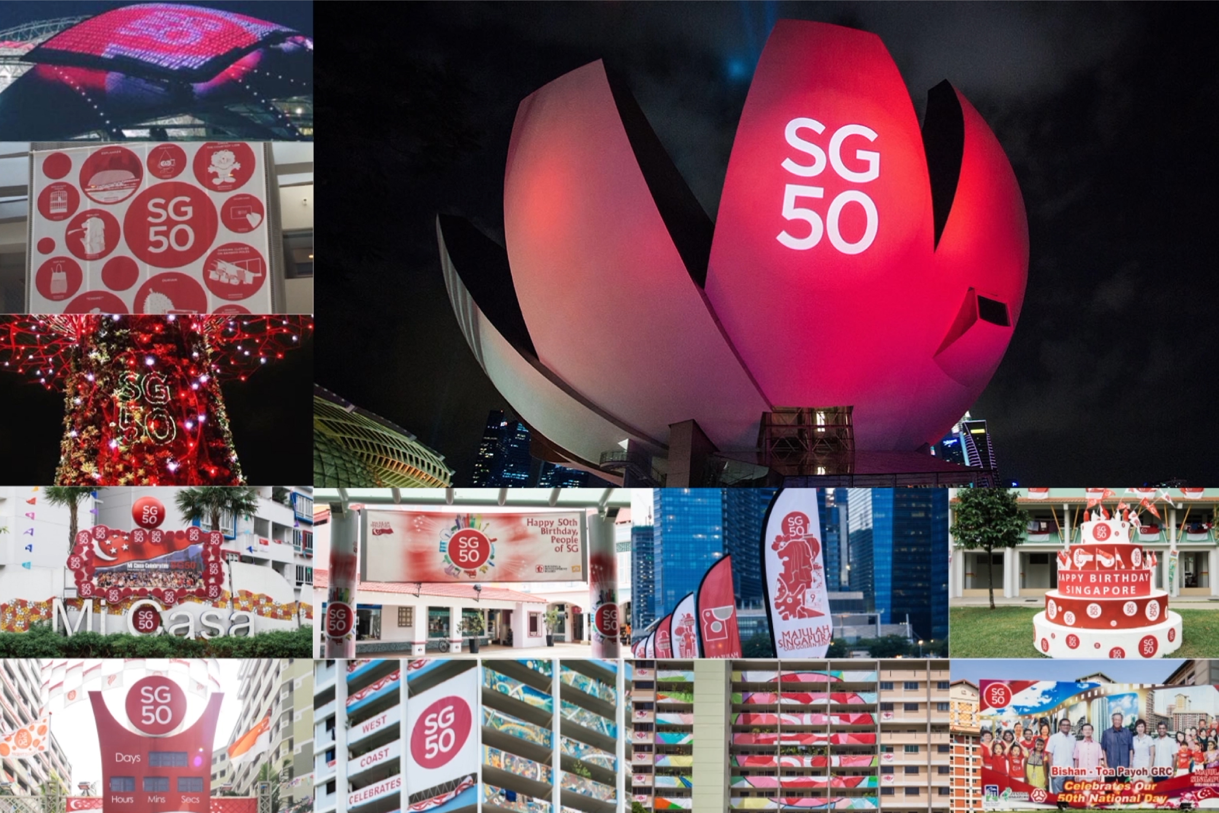
As the red dot made it challenging to fit the phrase “Singapore50” as originally requested by MCCY, Jackson proposed abbreviating it to “SG50” instead. He was inspired by Milton Glaser’s “I ♥ NY” symbol, which has made New York City instantly recognisable by its initials. The resulting simple design allowed the logo to be easily adapted across various media platforms—from being projected onto buildings and shrunk into an emoji—during the year-long campaign.

One of the things Singaporeans are constantly reminded of is how small we are, our lack of resources and our precarious situation. What is cool about Singaporeans is we took it in our stride. I thought it was time to officially call ourselves that.
Jackson Tan, Creative Director of BLACK
Its simplicity also riled some members of the public who felt that even a child could have come up with such a simple design, much less a professional designer. But Jackson sees it as a compliment. As a child, he enjoyed drawing the emblems of his superheroes, Batman and Superman. “It’s hard to design a logo that a three-year-old kid can find meaningful and knows how to draw,” he says.




Besides children, the SG50 logo is also designed for all Singaporeans to use and even customise. Its circular shape serves as a frame to hold different interpretations of what 50 years of Singapore means. Such a participatory approach to logo design came from Jackson’s early experience with the American music television brand, MTV. He saw how the logo retained its outline but allowed for transformation within. As part of PHUNK, the art and design collective which he co-founded in 1994, Jackson also got to reinterpret MTV’s logo for its various campaigns and collaterals.
The SG50 logo also serves as a platform for all Singaporeans to express their patriotism. While children coloured the state flag into the logo, netizens juxtaposed it against local icons such as the city’s ubiquitous public housing. Government agencies and private companies also created their own versions of the SG50 logo. For instance, the homegrown insurance firm Great Eastern blended it with a pacifier to celebrate babies born in 2015. The phrase “SG50” also caught on amongst Singaporeans. In response to the launch of Fifty Shades of Grey, a film adaptation of the best-selling erotic novel, the local literary community created the hashtag “#SG50ShadesofGrey” and came up with playful posts that juxtaposed sexual innuendo with the Singaporean way of life.


[It] gives the idea that it’s easily replicated or recreation. This means anybody or any company who wants to have their promotion tie-in with the campaign can just slap on the logo and call it a day. It was so simple, so powerful and so iconic.
Johnston Zhang, Multimedia Artist
The SG50 brand identity was so widely used that it even became overbearing for some. Multimedia artist Johnson Zhang created the website, Simi Sai Also SG50 (a colloquial term that means “Anything Also SG50”), to call out this phenomenon. SG50-branded items, ranging from advertisements to even fishcakes, were uploaded for the public to vote on their appropriateness.
For better or worse, the simple design of the logo encouraged its widespread use, says Johnson. “[It] gives the idea that it’s easily replicated or recreated. This means anybody or any company who wants to have their promotion tie-in with the campaign can just slap on the logo and call it a day,” he says. “It was so simple, so powerful and so iconic.”
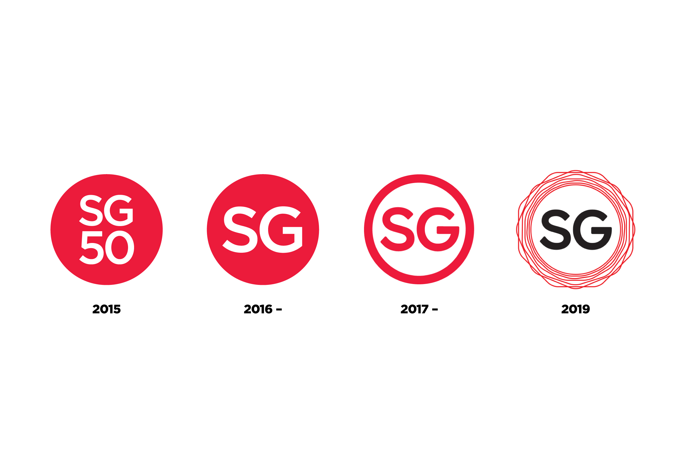
SG50’s success led MCCY to continue using it as a national mark even after the celebrations ended. BLACK helped to further simplify the logo to just “SG” in a red dot, and it has been used for other national initiatives, such as SGfuture, SG Cares and Our SG Fund. The brand identity has also been adapted by others for Singapore-related initiatives. As part of its “Passion Made Possible” campaign, the Singapore Tourism Board and Economic Development Board commissioned a mark with “SG” in a red circle for its collaterals to represent the Singapore stamp of quality and trust. In 2019, the SG logo also became part of Singapore’s bicentennial campaign to mark the 200 years of the arrival of Sir Stamford Raffles and the British to its shores. “SG” was encircled with seven poly-shapes, including the original circle, to symbolise Singapore’s evolution over 700 years from a thriving emporium for trade to a global metropolis.
‘SG’ for Singaporeans is a special thing because we now know ourselves as the ‘little red dot’. We should continue thinking about how this ‘SG’ brand can continue to grow internationally too.
Jackson Tan
Although BLACK did not design these logos, Jackson is proud of how his SG50 creation has become part of the country’s national identity.


