Jia CURATED
Revitalising the Brand Behind Bali’s Celebrated Craft & Design Festival
Identity refresh for a Craft, Design and Culture Festival in Bali
-
Client
Ong Cen Kuang
-
Team
Jackson Tan
Samantha Pang
Annie Wu
Best Patchanon Suwannamai
-
Client
Ong Cen Kuang
-
Team
Jackson Tan
Samantha Pang
Annie Wu
Best Patchanon Suwannamai
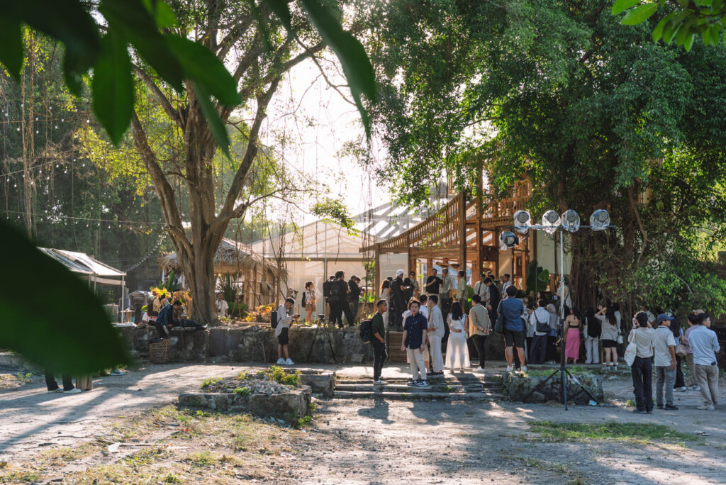
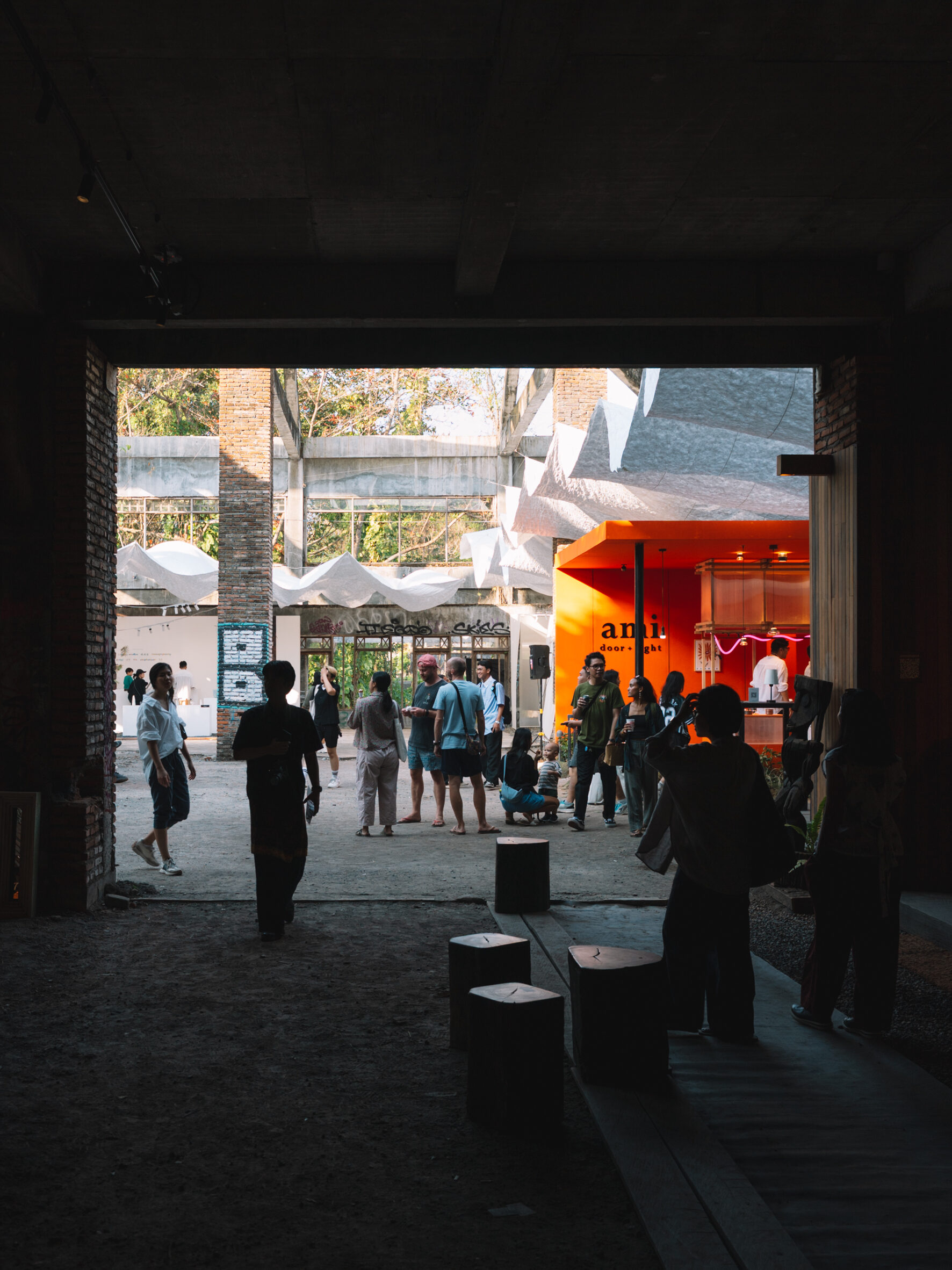
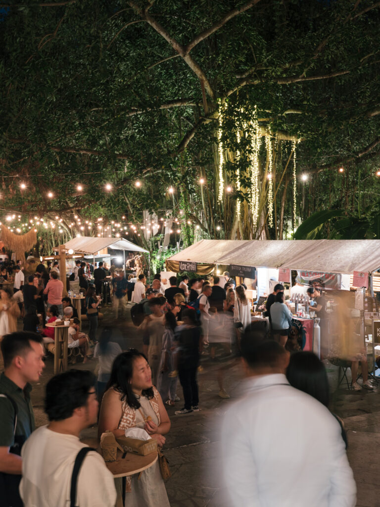
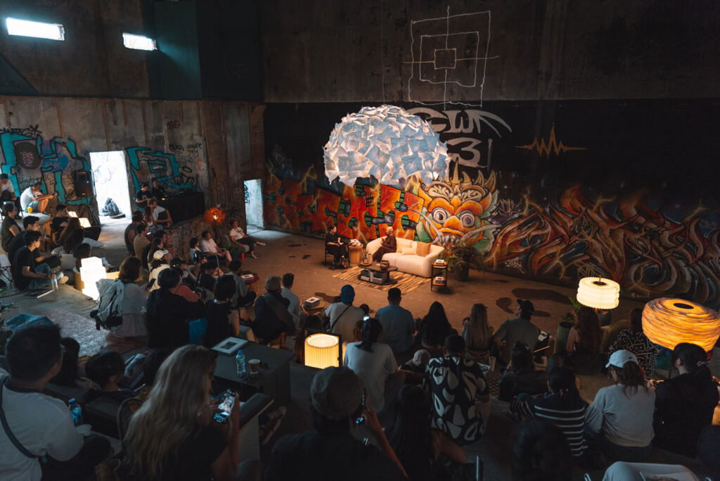
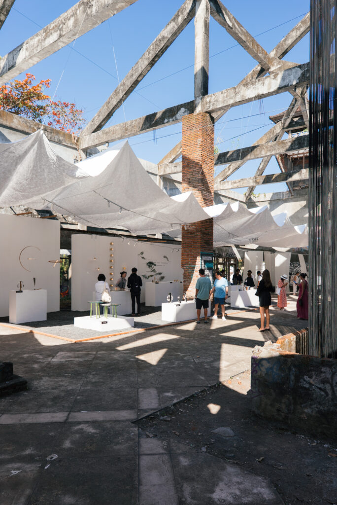
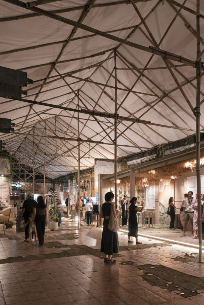
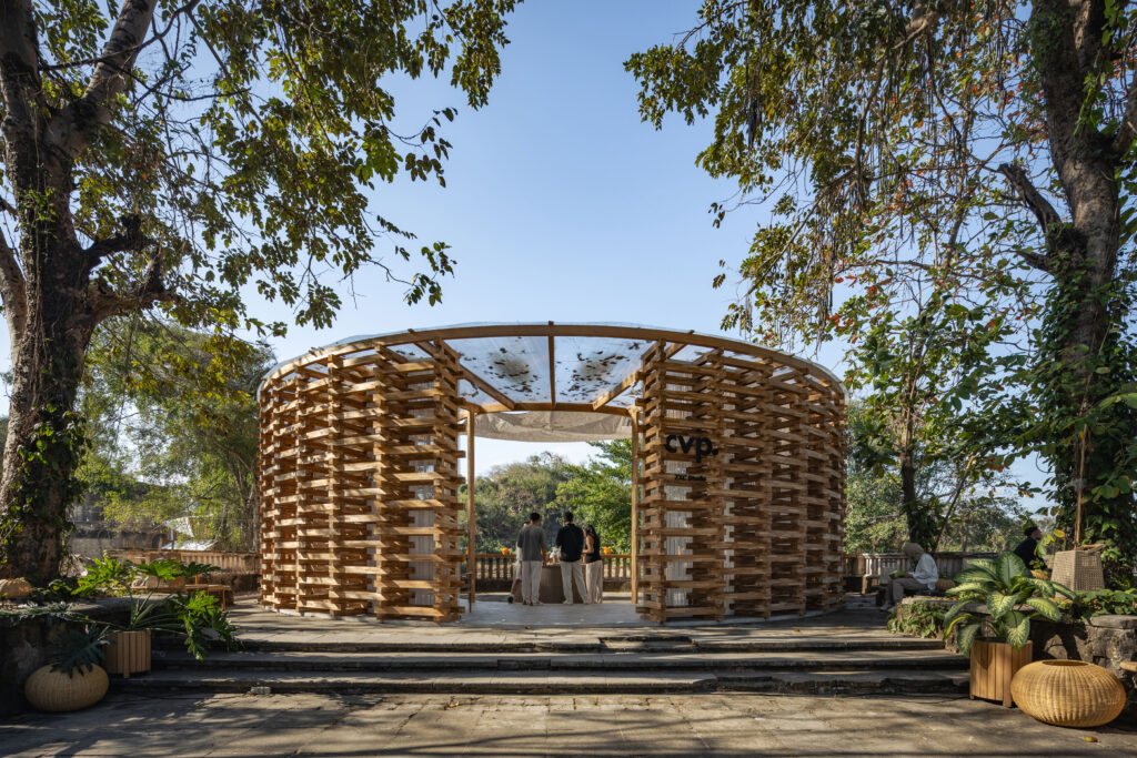
Jia CURATED, originally known as Jia Curated Kiosks (JCK), is an immersive weekend the celebrates craft, design and culture. Launched in July 2022 and set in Bali — a prominent international creative hub known for its seamless blend of local traditions and global influences — Jia CURATED naturally found its home in a place where community and creativity thrive.
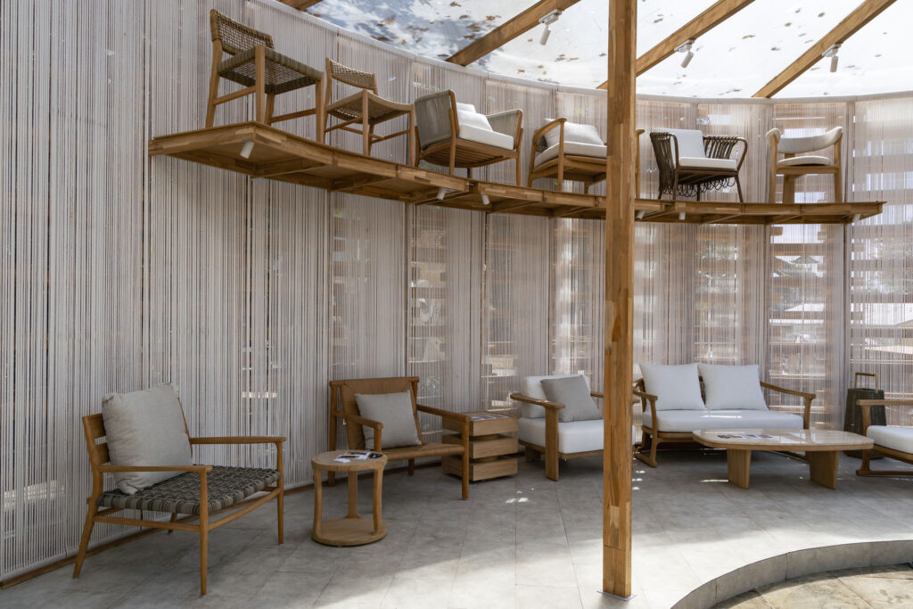
Led by Budiman Ong, Rudi Winata, and Yang Yang Hartono, the initiative was born from a shared desire to build a more meaningful, community-driven platform for creators and their work — something existing bazaars failed to offer. Instead of adapting to conventional formats, the founders created their own event that brings together exhibitions, installations, talks, workshops, live music, and food and beverage experiences.
As the team prepares for its fourth edition, BLACK was commissioned to revitalise the brand identity. This included a review of their brand hierarchy, clarification of brand communications, a refreshed logo, and updated brand applications, all created to better articulate the brand’s vision, mission, purpose and values as it continues to grow.
To better understand their needs, challenges and aspirations, BLACK began with a series of workshops with the founders, gathering insights that would later inform key design decisions.
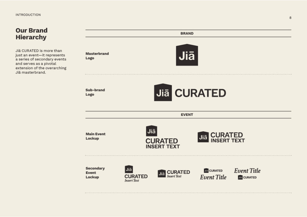
One of the first outcomes was the decision to simplify the original name, Jia Curated Kiosks, to Jia CURATED. The word “Jia”, meaning “home” in Mandarin, was retained for its strong associations with comfort, connection, and sanctuary, qualities that resonate closely with the brand. While alternatives to “Curated” were considered, the team felt it best captured the spirit of thoughtfully selected crafts and creators that bring the community together. The term “Kiosks” was removed, as it implied a traditional bazaar rather than the immersive nature of the event. This renaming also helped clarify the brand hierarchy, positioning Jia as the masterbrand for Jia CURATED and its future sub-brands.
The design process began with explorations of the house symbol, an iconic element from the original logo that best represented the idea of home. BLACK experimented with variations in shape, scale and proportion, eventually evolving the symbol from a keyline outline to a solid shape, with refinements to its form for greater clarity and visual impact. The “Jia” text within the house was also redrawn, featuring an updated typeface that better aligns with the “Curated” wordmark, resulting in a more cohesive and distinct brand expression.
The logo system was extended into various lockups to incorporate details such as the event year or location. These were designed in both vertical and horizontal formats to offer flexibility across applications.
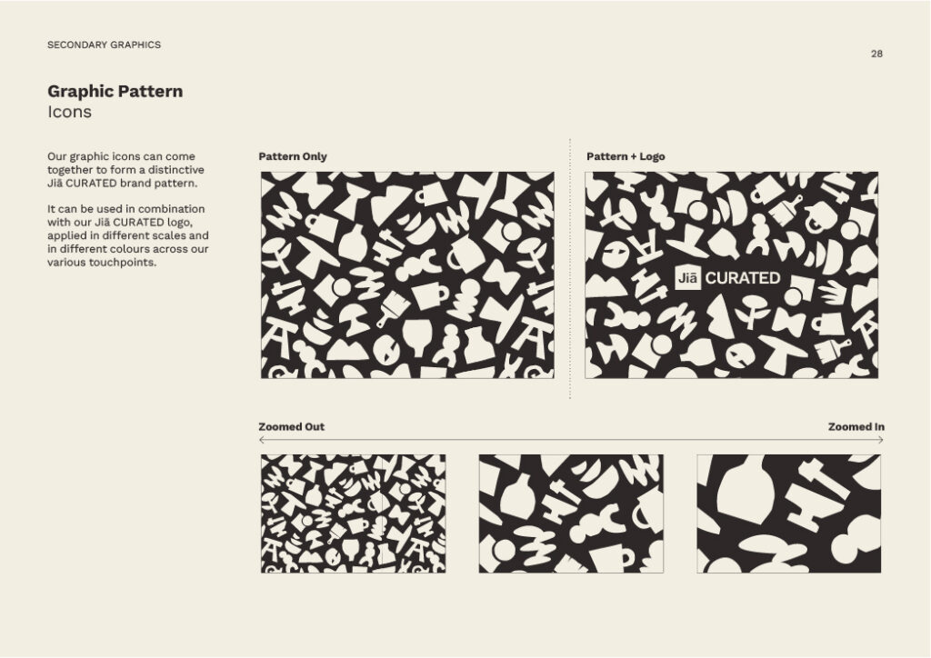
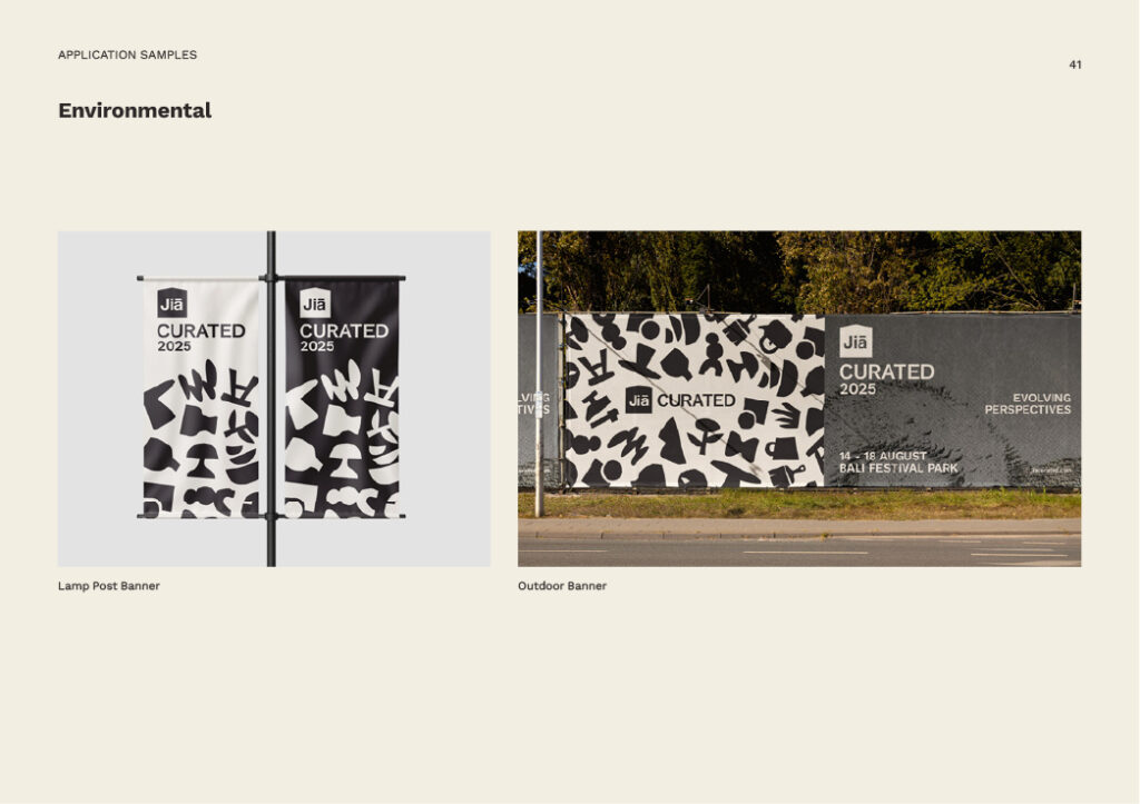
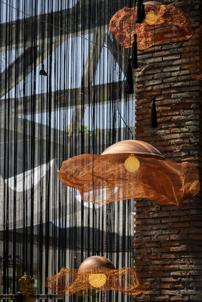
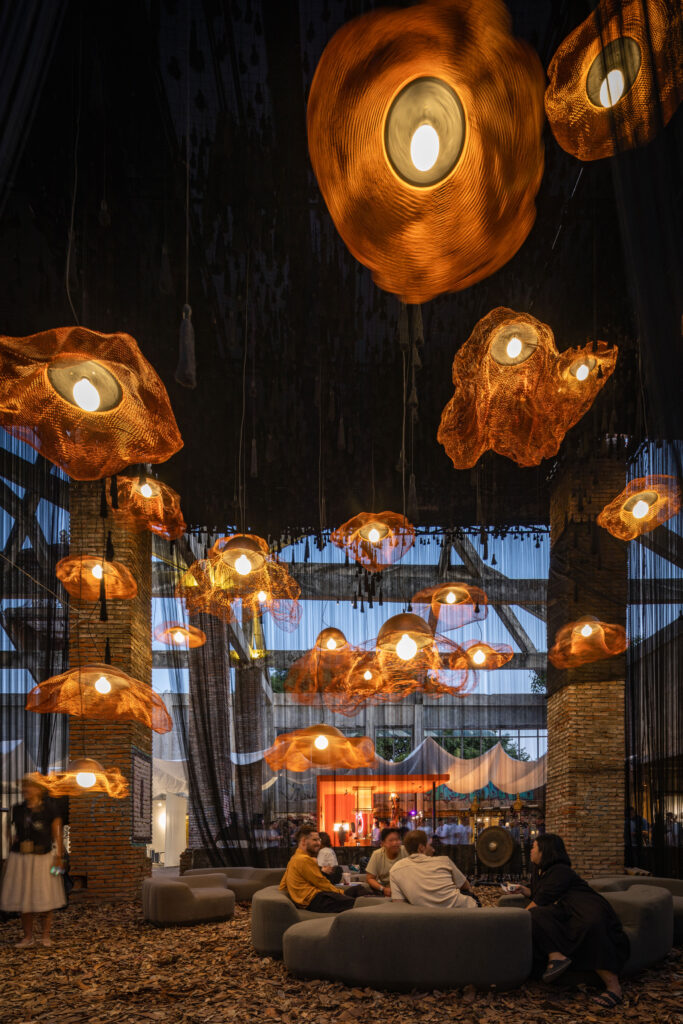
The house symbol became a defining element of the brand’s visual language, shaping the overall aesthetic and appearing consistently throughout the identity. It is used as a pattern, pictograms, a framing device, and even a punctuation mark to subtly reinforce the brand presence. Complementary icons and patterns reflecting the brand’s values, offerings, and programmes were also developed to enhance communication across digital platforms and physical touchpoints, including wayfinding.
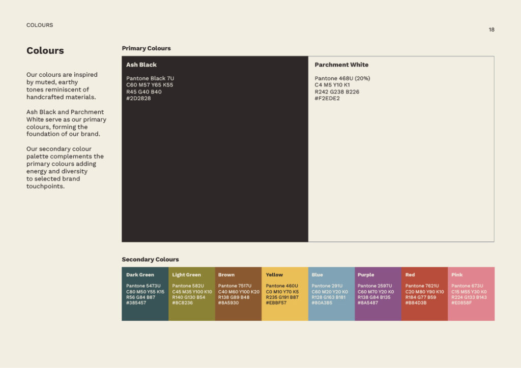
These elements are expressed through a refreshed colour palette inspired by the muted and earthy tones of handcrafted materials. Ash Black and Parchment White form the brand’s core colours, providing a neutral foundation, while a selection of secondary colours was introduced to add energy and diversity across specific applications.
BLACK’s refreshed identity for Jia CURATED unifies the Jia brand, thoughtfully reflecting its core values and the creative spirit that drives the community. This revitalisation is supported by a comprehensive set of brand guidelines, which extend across all brand applications to ensure consistent and cohesive expression. From digital platforms to physical touchpoints, the guidelines provide clear direction on visual elements, tone, and usage, empowering the brand to communicate its purpose effectively as it continues to grow and engage its audience.
Read More + Go Back -