National Heritage Board
Pride in Our Past, Legacy for Our Future
Identity refresh for the custodian of Singapore’s heritage
-
Client
National Heritage Board
-
Team
Jackson Tan
Charice Chan
Samantha Pang
Patricia Krisan
-
Client
National Heritage Board
-
Team
Jackson Tan
Charice Chan
Samantha Pang
Patricia Krisan
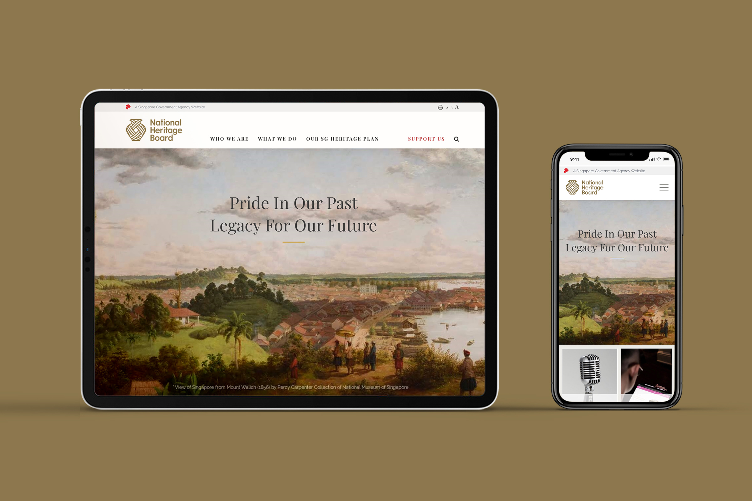
Since the National Heritage Board (NHB) was established in 1993, Singapore and Singaporeans have come to embrace a growing collection of traditions, cultures, experiences, stories, and skills—intangible aspects of our heritage that complement the tangible artefacts of our history. The role of the NHB has thus evolved beyond promoting a culture of museum-going and arts appreciation, into one that helps to preserve our heritage for the future.
To reflect this shift in the organisation’s purpose, BLACK was commissioned to refresh NHB’s brand identity. The rebrand would mark the NHB’s progress, modernising the institution for the future while paying tribute to its legacy.
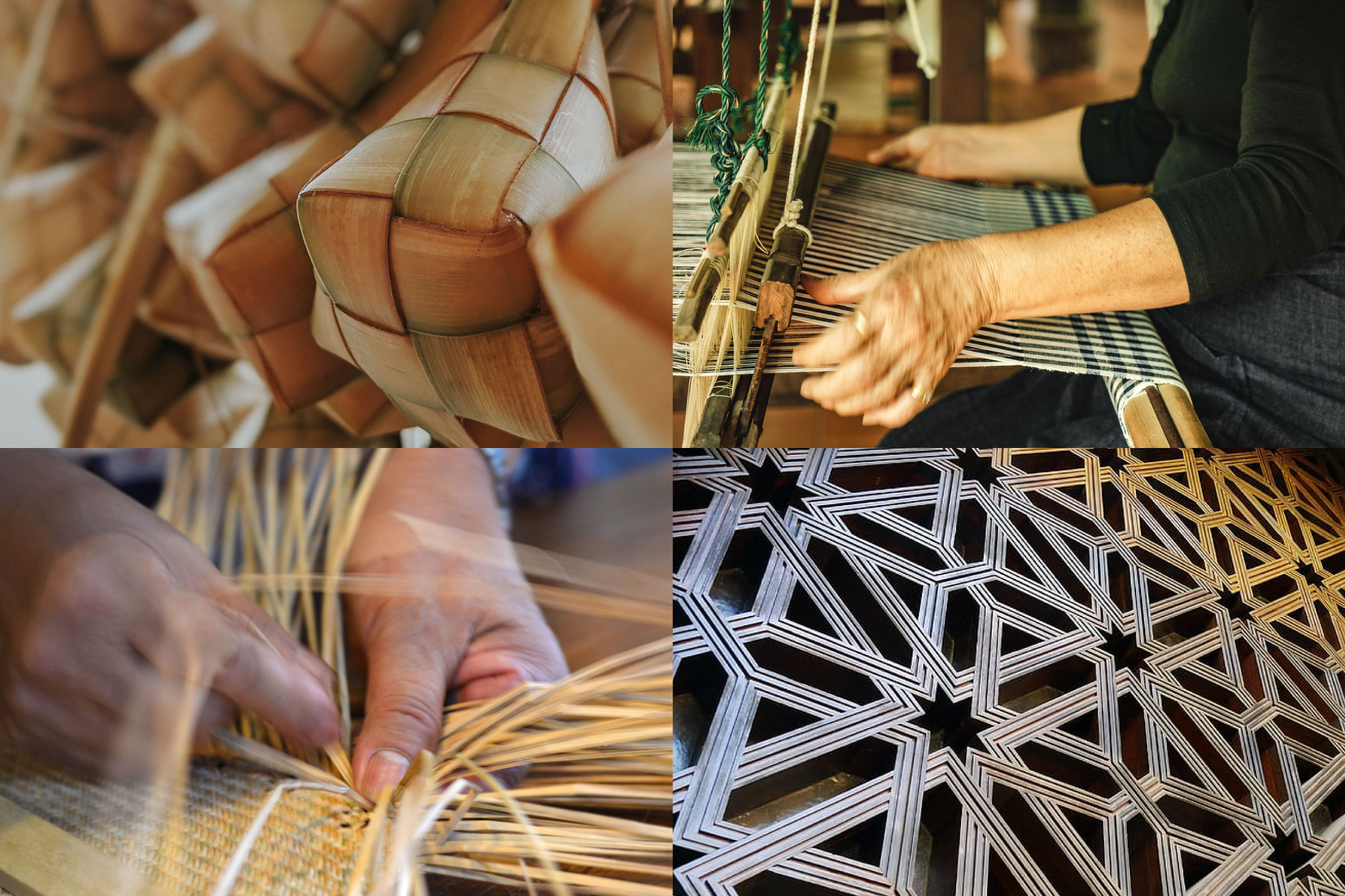
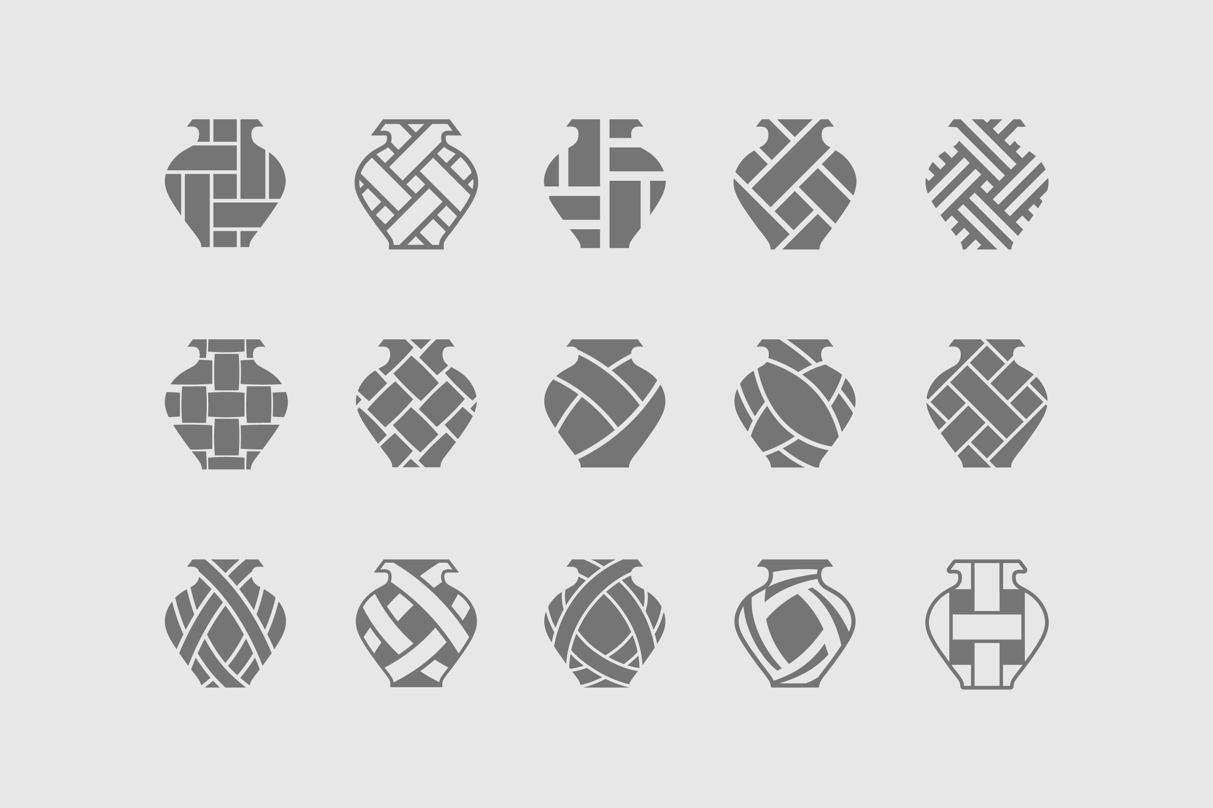
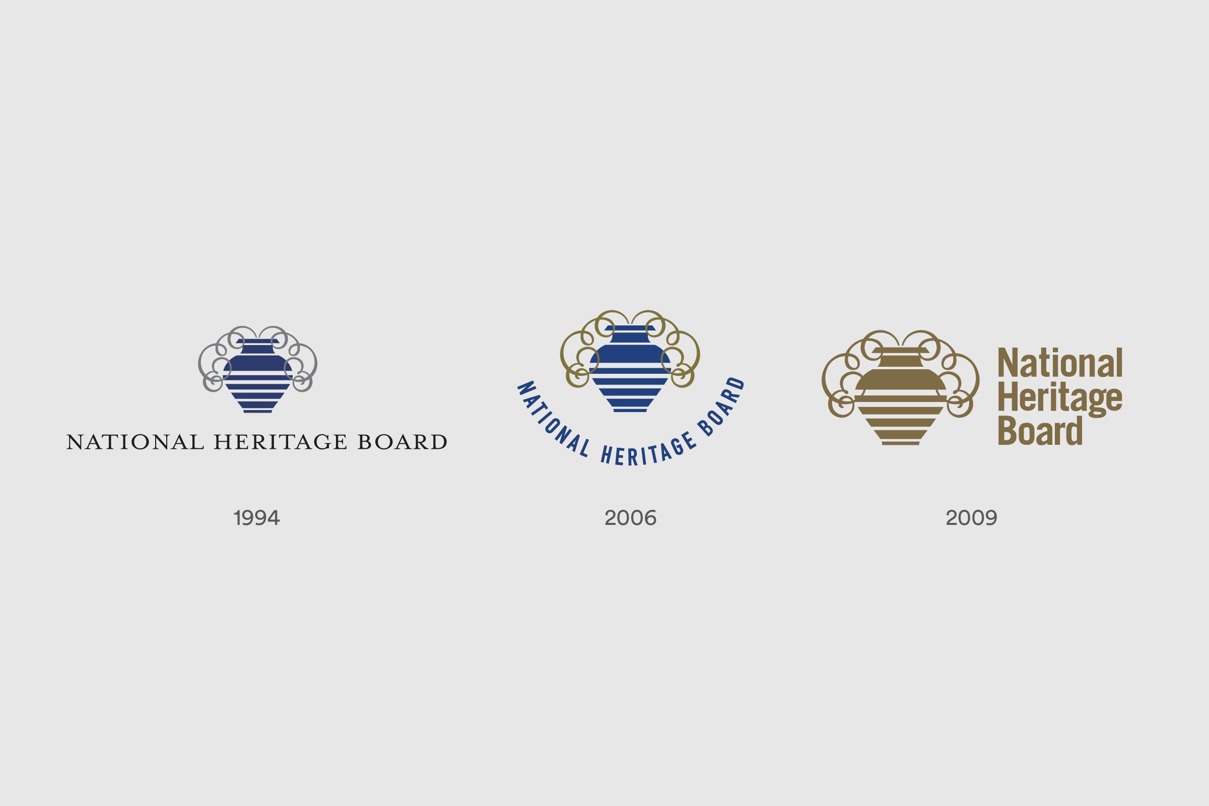
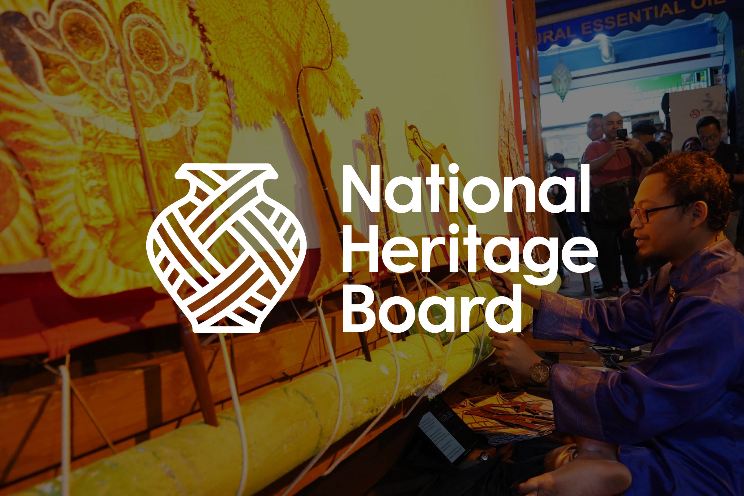
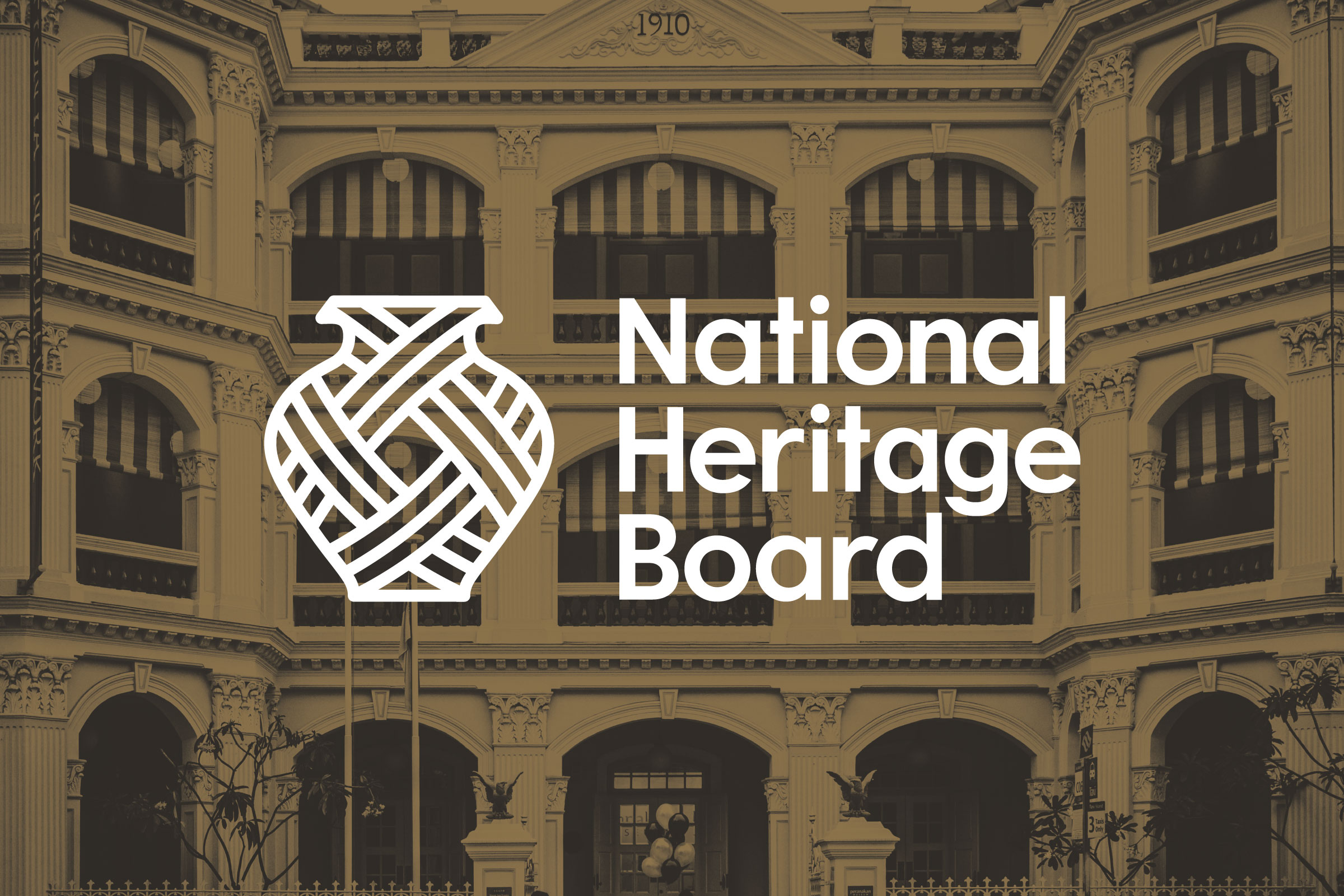
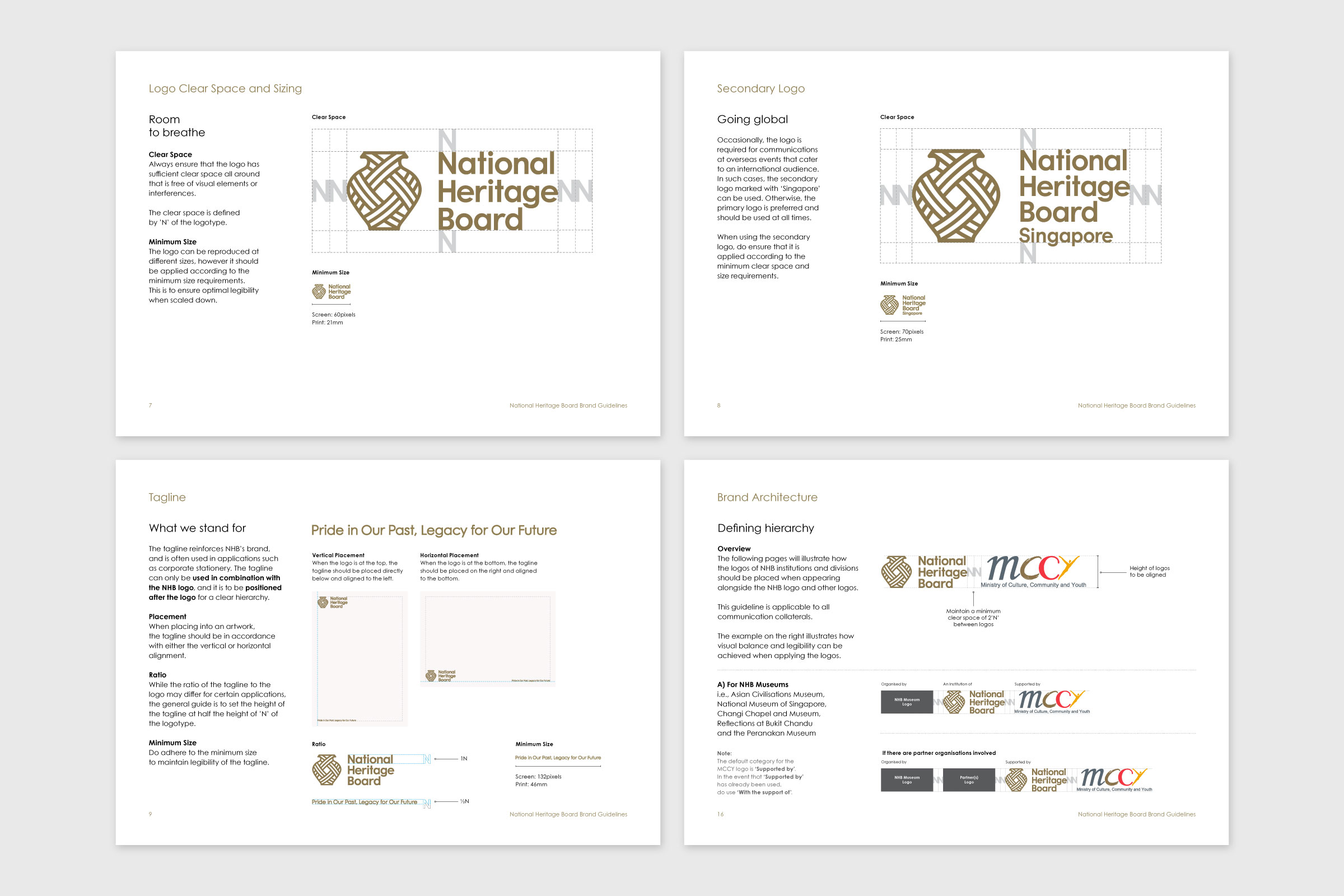
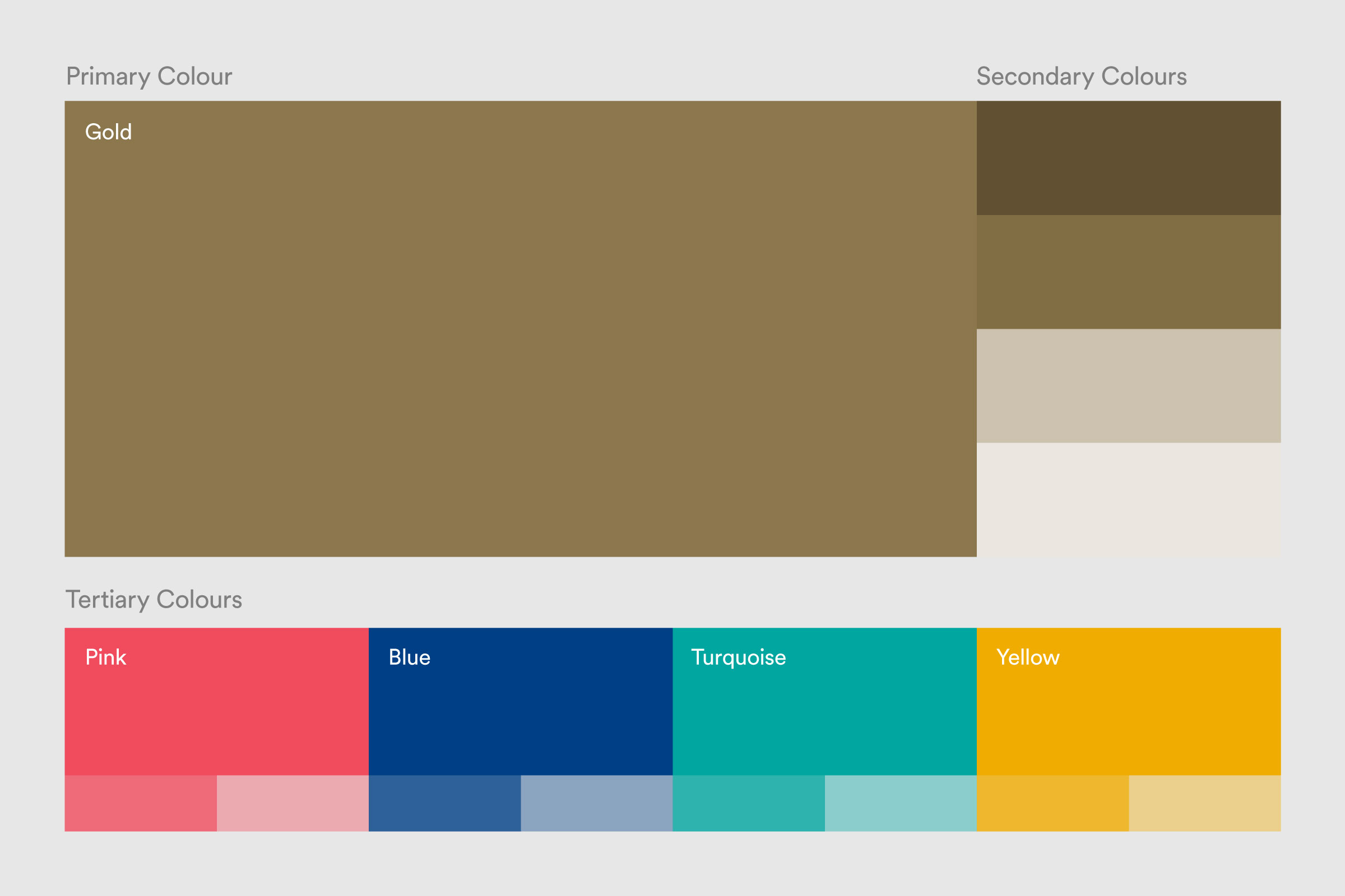
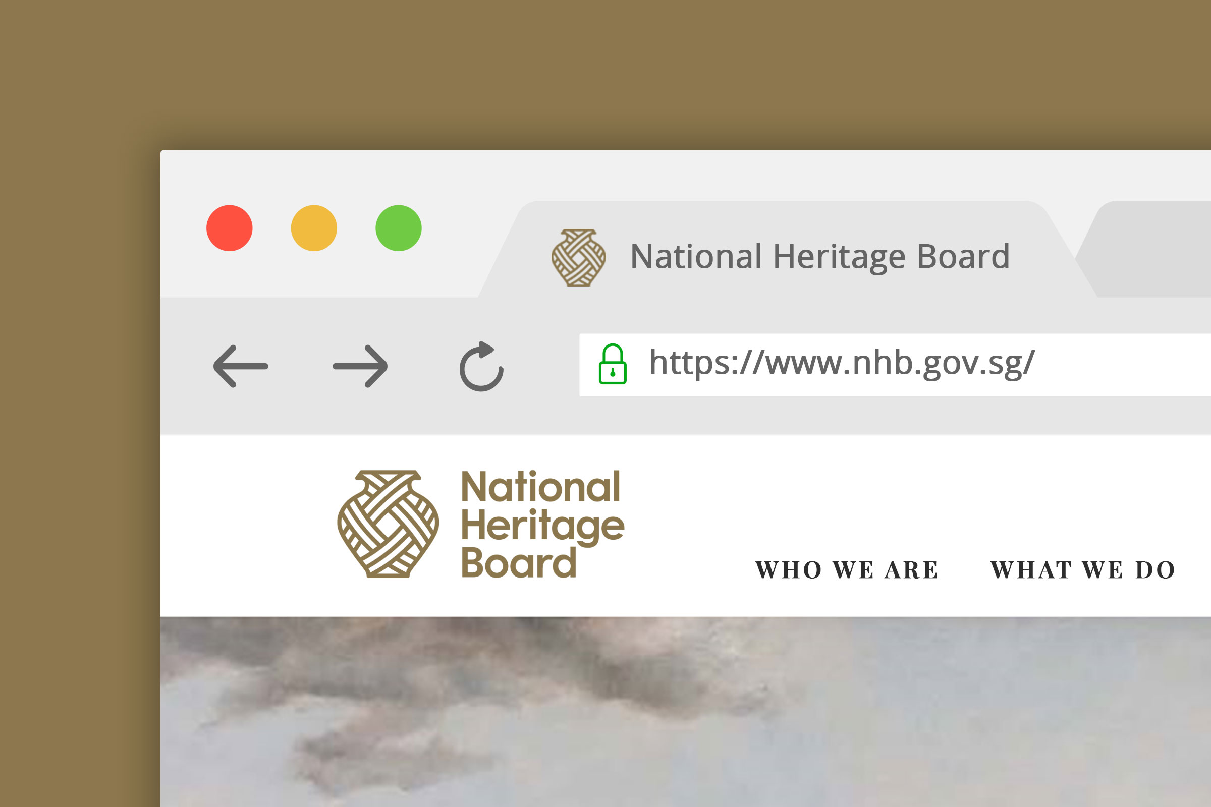
Having been core to NHB’s identity since the beginning, the logo’s vessel icon was retained, as was its original gold colour, which evokes a sense of establishment and value. We introduced the graphic of a weave—a common motif across religious symbols, cultural traditions and handcrafted goods of Southeast Asia—to symbolise the interwoven cultures, traditions, experiences and stories that shape our multicultural heritage and identity. The angles of the weave were designed to translate well across different platforms and dimensions, and adapted as a secondary graphic to be applied in the various tones of the secondary colour palette.
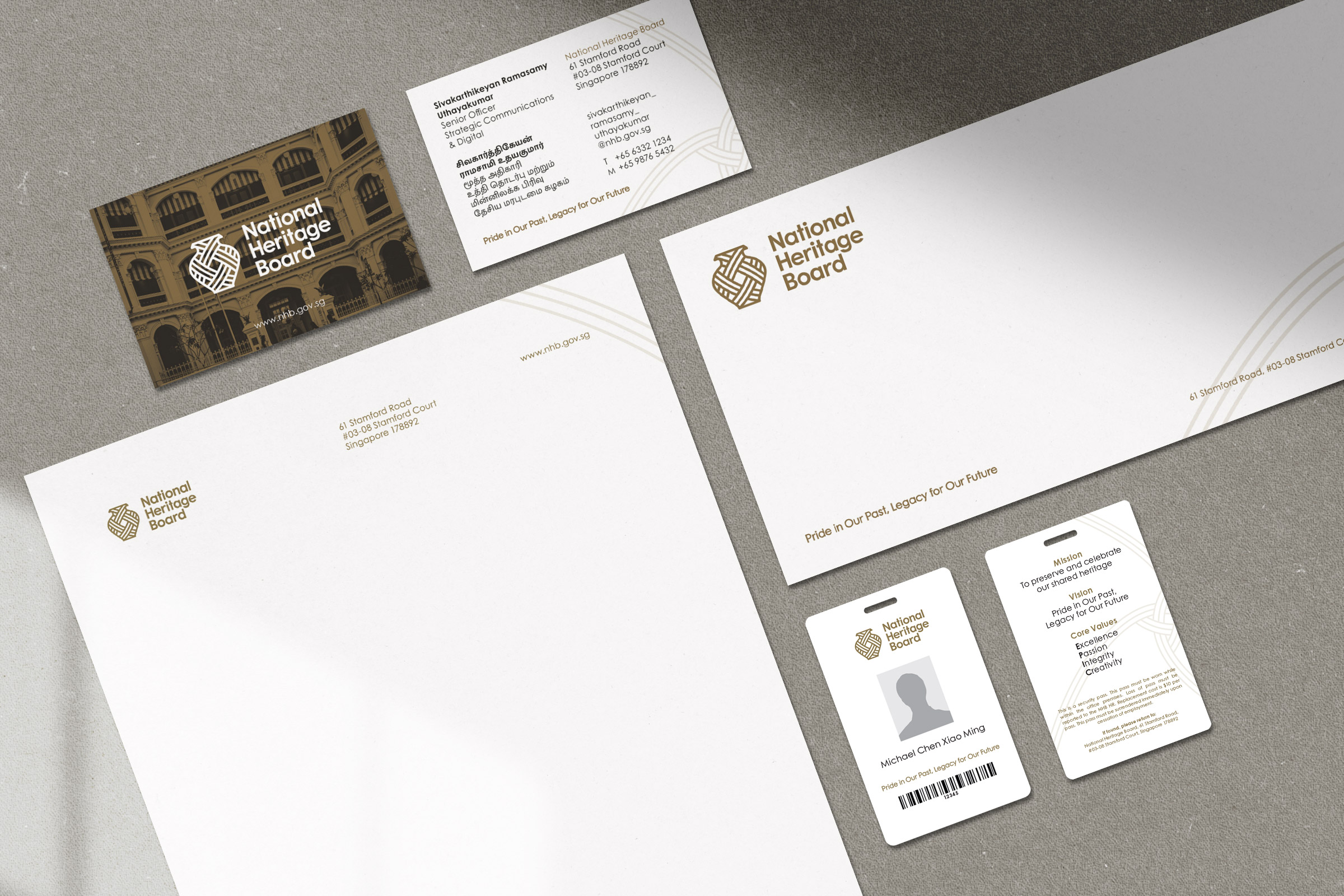
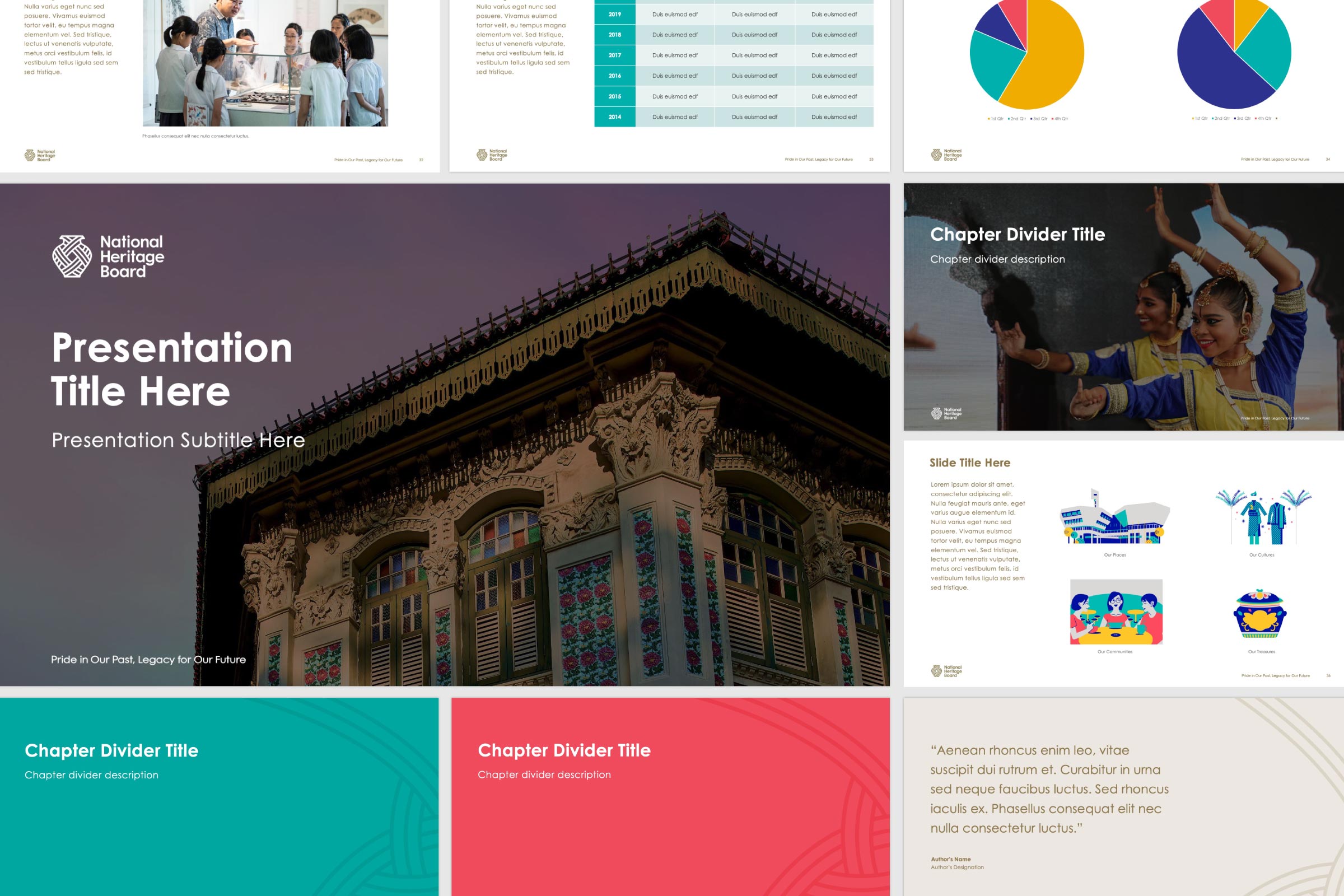
The logotype was adapted from Century Gothic for a more contemporary look. The result is a soft, open, and friendly type that flows from one character to the next, and subtly mirrors the curves of the vessel. A comprehensive set of brand guidelines was also developed, detailing information including brand applications such as corporate stationery, a presentation slide template and signage.
Read More + Go Back -