SG
Branding Singapore for the Future
Identity to celebrate Singapore and Singaporeans
-
Client
Ministry of Culture, Community and Youth (MCCY)
-
Team
Jackson Tan
Stella Kwan -
Collaborators
-
Client
Ministry of Culture, Community and Youth (MCCY)
-
Team
Jackson Tan
Stella Kwan -
Collaborators
Our process of creating the SG50 identity in celebration of Singapore’s 50th birthday in 2015 prompted us to consider how we wanted to be known and remembered by Singaporeans and people around the world. This drove us to build an identity that would inform the Singapore brand. Referencing other national and city branding exercises that established symbols like I ❤ NY, as well as universally recognised abbreviations like HK (Hong Kong), the UK (United Kingdom), and the USA (United States of America), we saw the opportunity for Singapore to be known as SG, with SG50 being a platform for us to kick-off the process of our national branding.
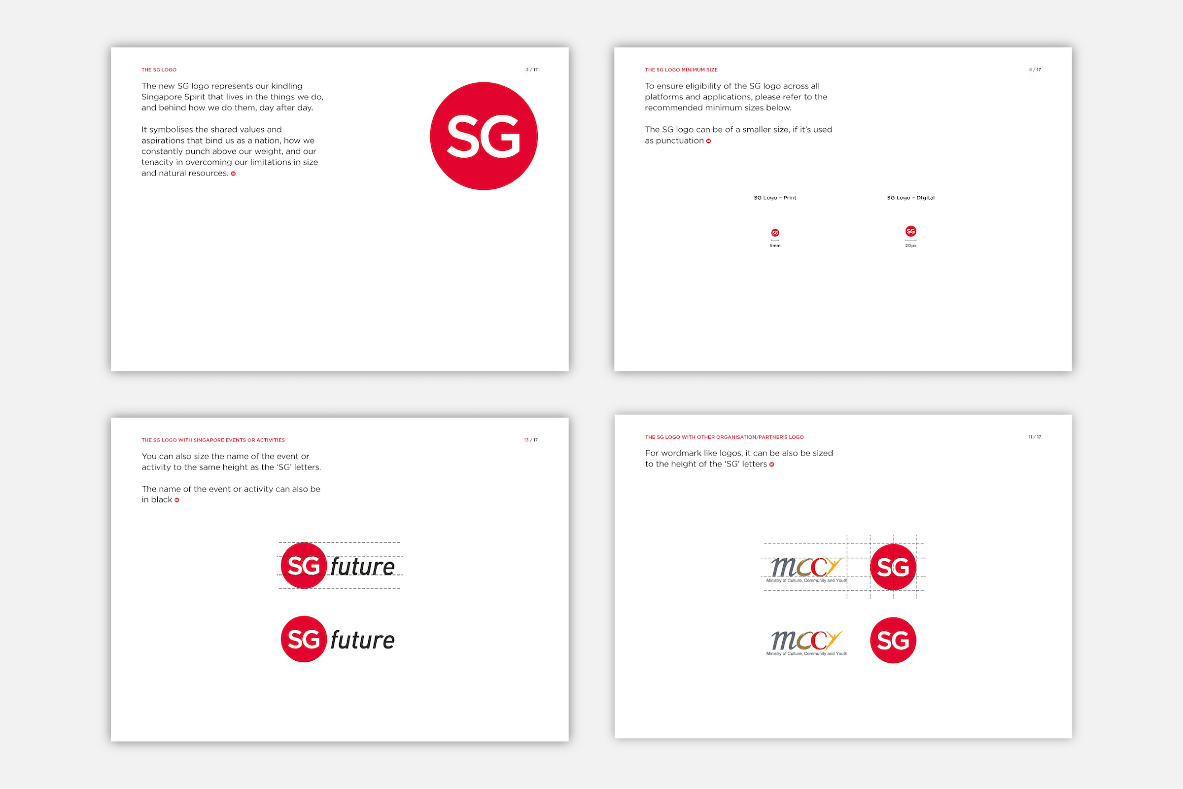
Following the success of SG50, BLACK was invited by the Ministry of Culture, Community and Youth (MCCY) to transform the logo into the SG logo—an identity that would continue to carry Singapore and Singaporeans forward into the years ahead. We worked in collaboration with Ogilvy to evolve the brand, and simplified the SG logo to “SG” contained within a red dot. It retains the element of the “little red dot”, a term that Singaporeans have embraced with pride and endearment.
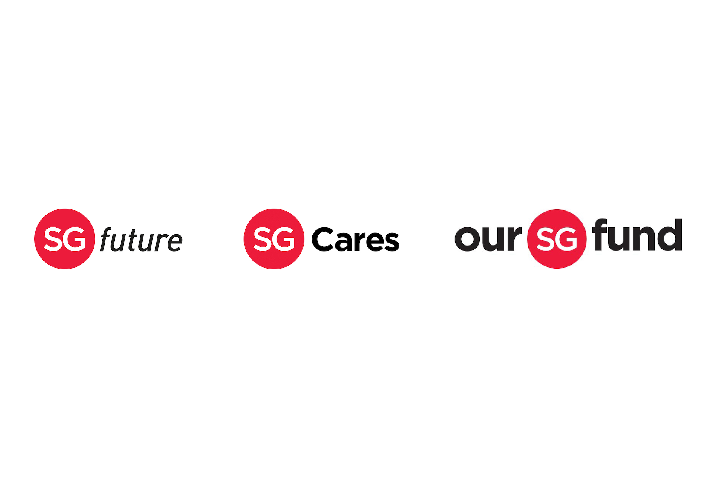
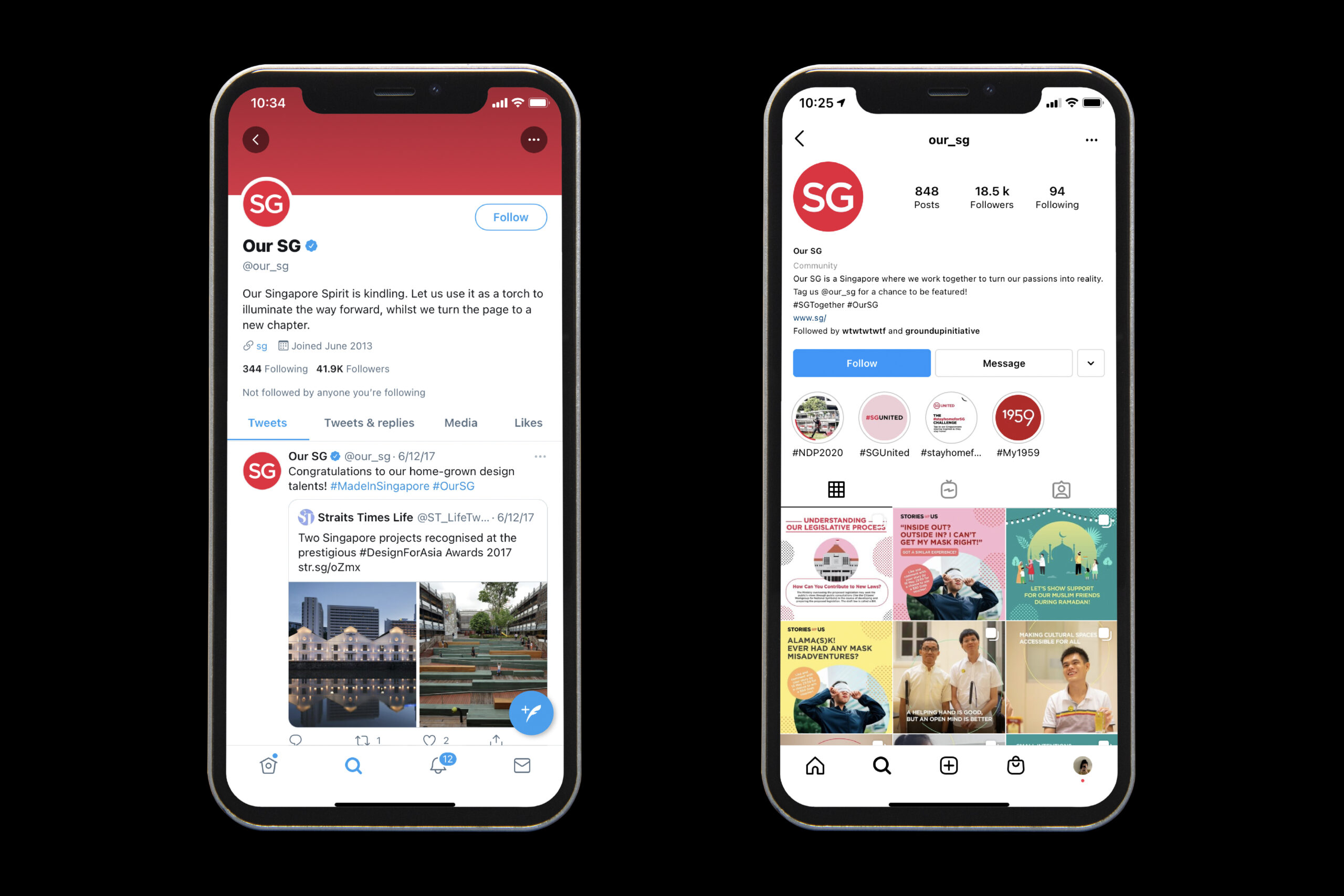
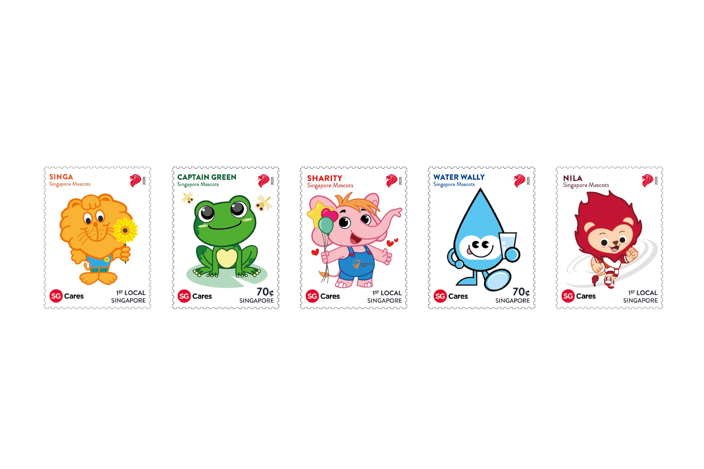
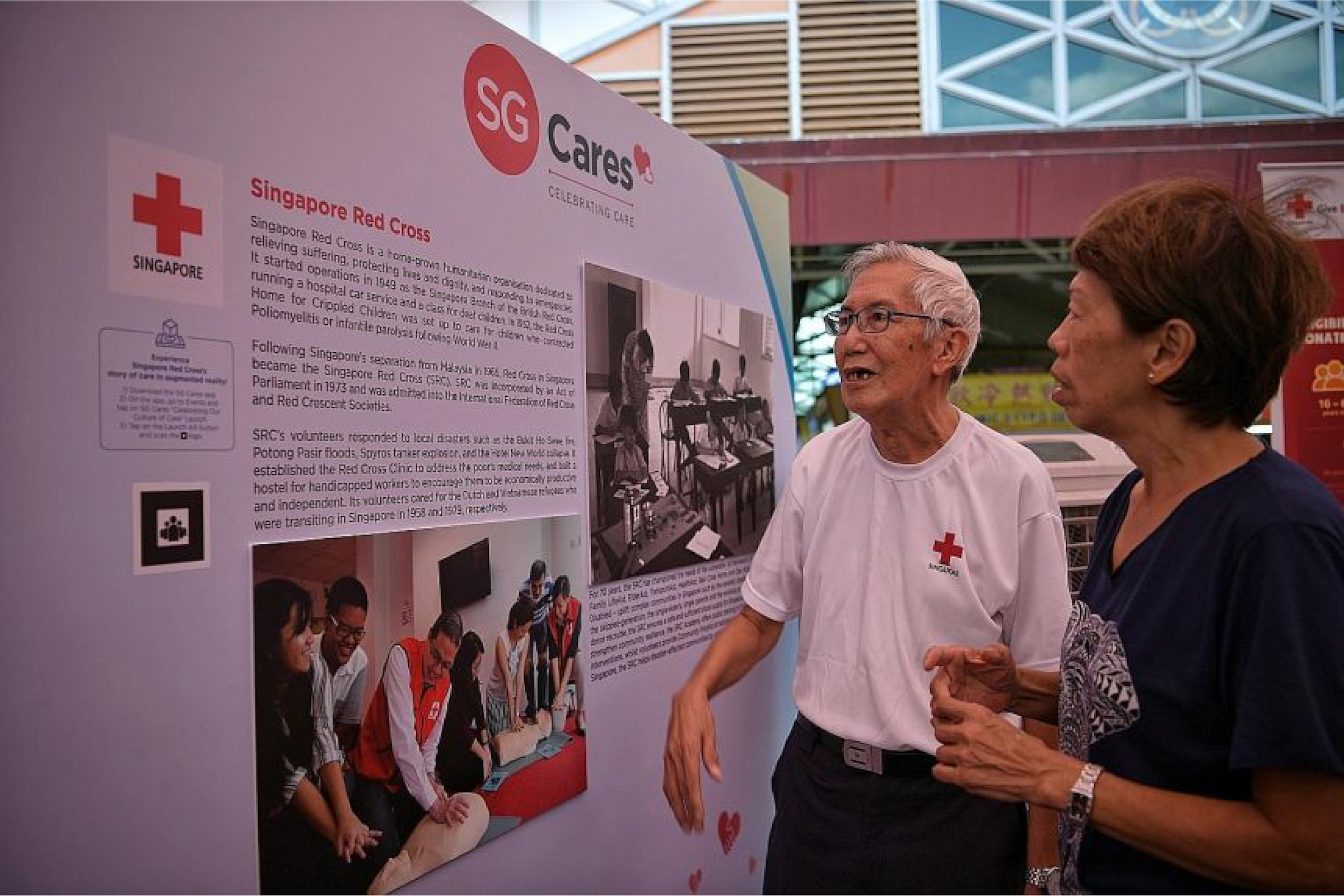
The SG logo has been adopted alongside national initiatives and campaigns such as SGfuture and SG Cares (led by Ogilvy), Our SG Fund, and adapted by others for Singapore-related initiatives. As part of its “Passion Made Possible” campaign, the Singapore Tourism Board and Economic Development Board commissioned a mark with “SG” in a red circle for its collaterals to represent the Singapore stamp of quality and trust.
In 2019, the SG logo became part of Singapore’s bicentennial campaign to mark 200 years since the arrival of Sir Stamford Raffles and the British to our shores. “SG” was encircled with seven poly-shapes, including the original circle, to symbolise Singapore’s evolution over 700 years from a thriving emporium for trade to a global metropolis.
Read More + Go Back -