Jurong Lake Gardens
Jurong Lake Gardens
Identity for Singapore’s third national garden and first in the heartlands
-
Client
National Parks Board (NParks)
-
Team
Jackson Tan
Samantha Pang
Tee Xinyi
-
Photography
-
Client
National Parks Board (NParks)
-
Team
Jackson Tan
Samantha Pang
Tee Xinyi
-
Photography
Jurong Lake Gardens is Singapore’s third national garden and the first in the heartlands. Nestled within the Jurong Lake District, this 90-hectare green oasis is thoughtfully designed to bring families and communities together. It comprises the scenic Lakeside Garden, along with the newly rejuvenated Chinese and Japanese Gardens, which reopened in 2024. Envisioned as a people’s garden, Jurong Lake Gardens offers a welcoming space where the community can enjoy curated thematic landscapes in the heart of Jurong.
Once a vast expanse of mangrove swamps, jungles and fishing villages, Jurong was transformed in 1961 through an industrialisation programme that levelled hills and reclaimed swampland to make way for industry, housing, and recreation. By the 2000s, it had grown into a self-sufficient town, envisioned as a distinctive lakeside destination for both business and leisure.
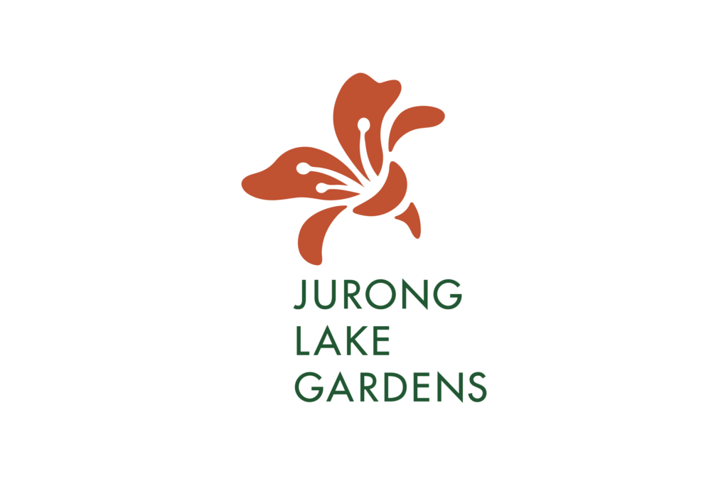
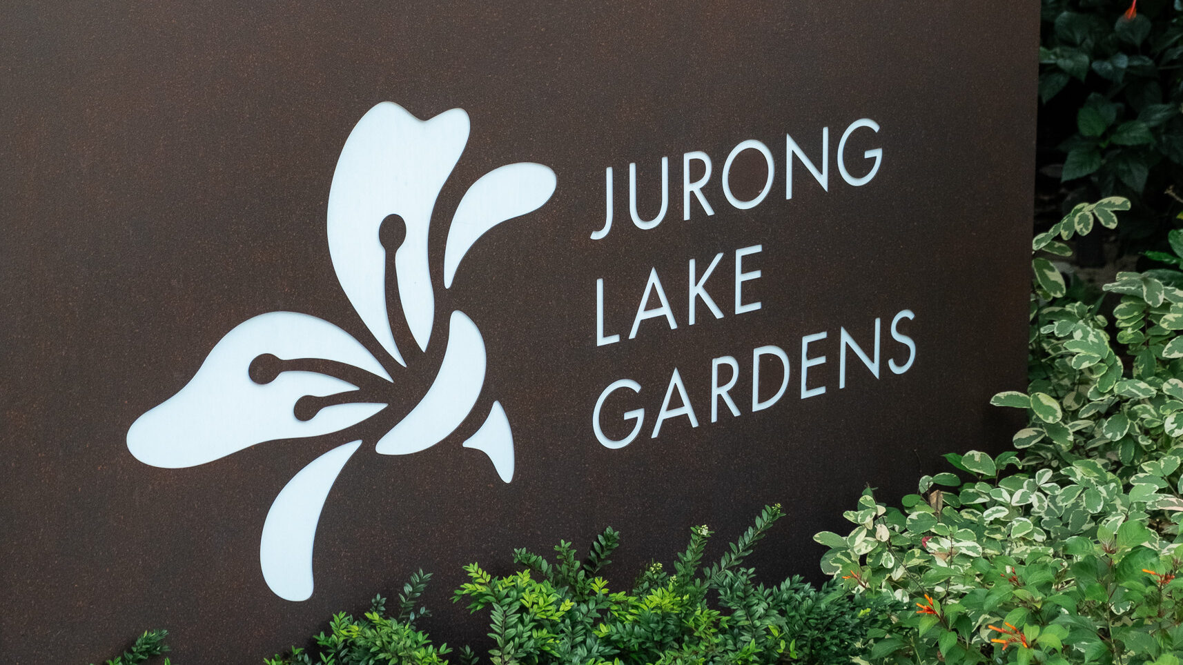
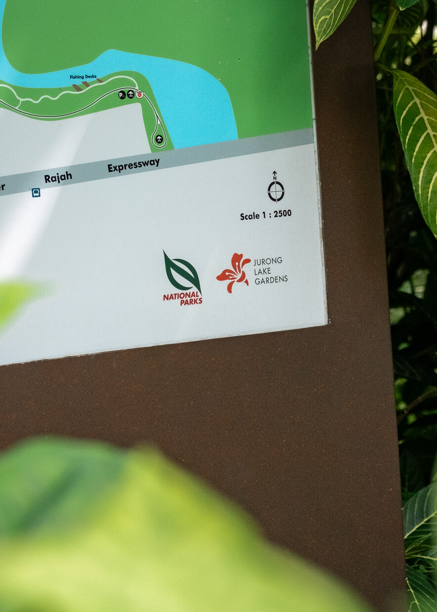
Through dialogue with key stakeholders, NParks and BLACK identified the Mempat tree (Cratoxylum Formosum) as a symbol for Jurong’s transformation. Known for its delicate pink blooms that emerge after cycles of dry and wet weather, the Mempat embodies resilience, renewal and growth. Pink flowering trees are thoughtfully lined along selected areas of the park, forming a distinctive landscape that reflect Jurong’s journey from swamplands and industry to a vibrant national garden in the heartlands. The symbol is paired with NParks’ brand typeface, Futura, to convey consistency and clarity.
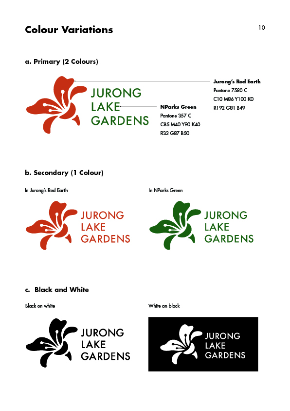
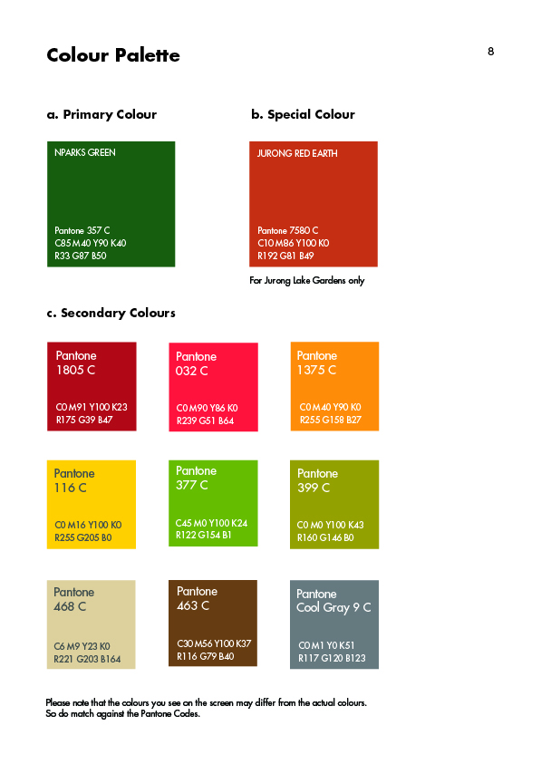
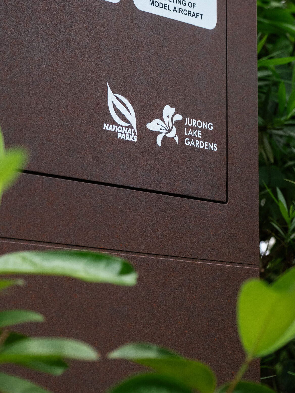
To ensure visual cohesion with the wider NParks identity, NParks Green was incorporated into the Jurong Lake Gardens Brand. This familiar colour anchors the garden within the larger NParks family, reinforcing its role as Singapore’s third national garden while ensuring consistency and recognition across platforms.
Complementing this is Jurong Red Earth, a distinctive colour discovered during the excavation process. Inspired by the tones of Jurong’s natural soil, it grounds the brand in the area’s history and landscape, offering a sense of place that is both authentic and memorable.
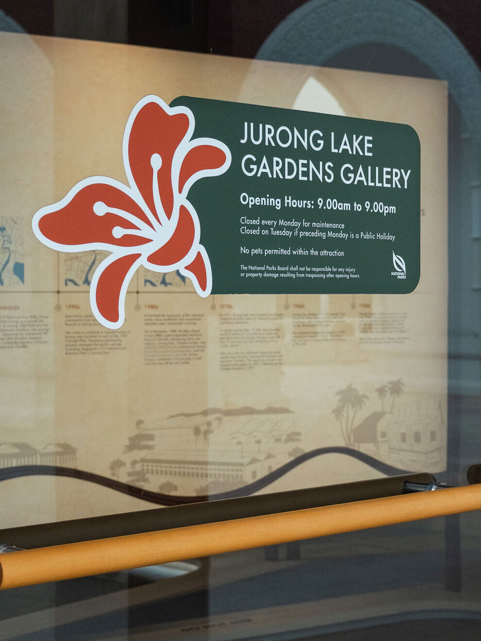
As part of the project, a comprehensive brand guideline was developed. It details the use of the logo, colour palette and typeface, while also providing direction for applications across merchandise, print and digital platforms.
Read More + Go Back -