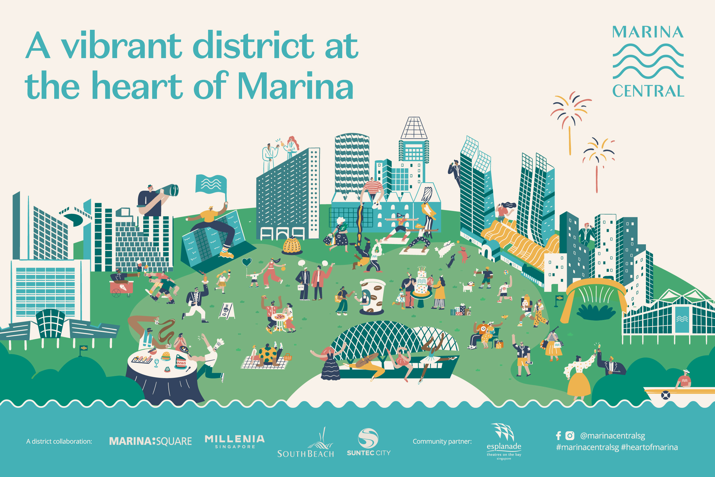
Marina Central
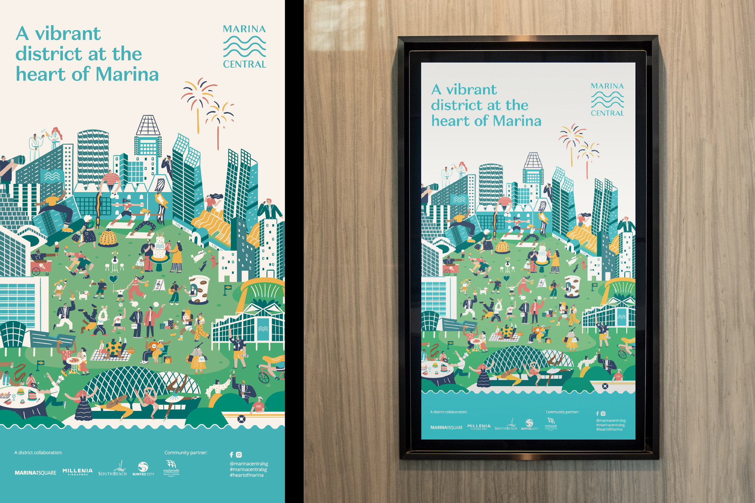
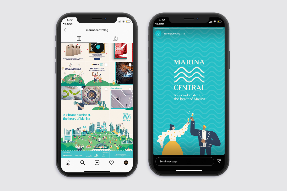
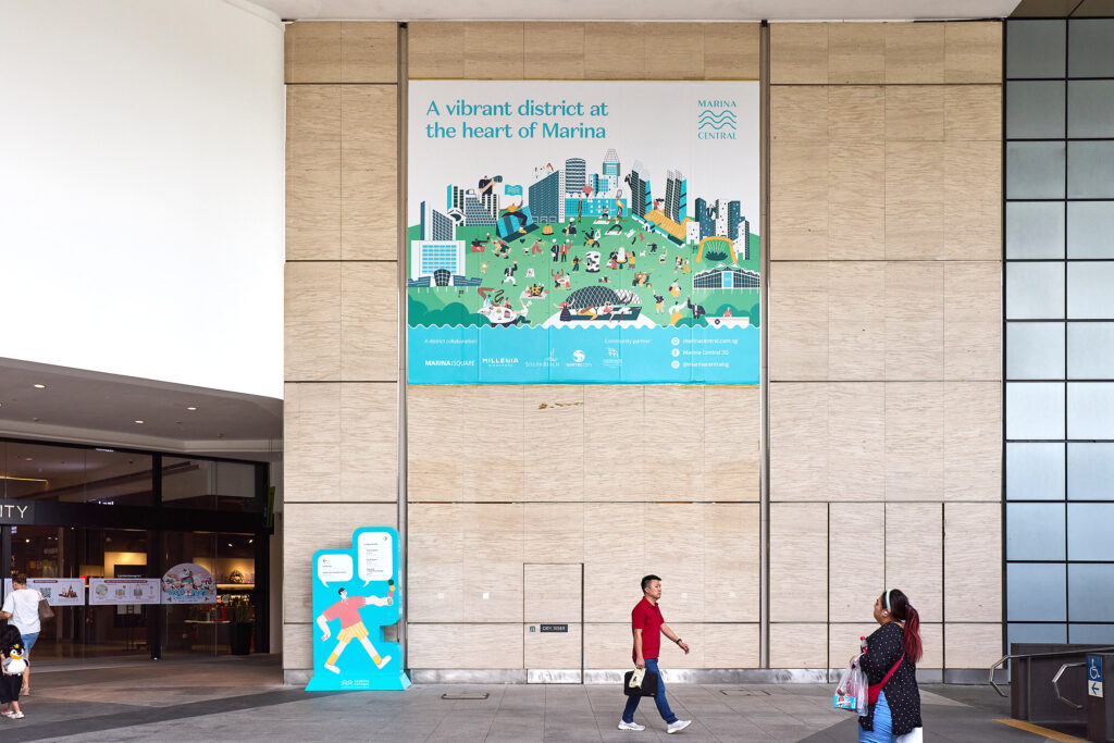
A vibrant district at the heart of Marina
Identity for an iconic district of business and leisure
-
Client
Marina Promenade Limited
-
Team
Jackson Tan
Charice Chan
Lee Xinying
Tee Xinyi -
Collaborators
-
Client
Marina Promenade Limited
-
Team
Jackson Tan
Charice Chan
Lee Xinying
Tee Xinyi -
Collaborators
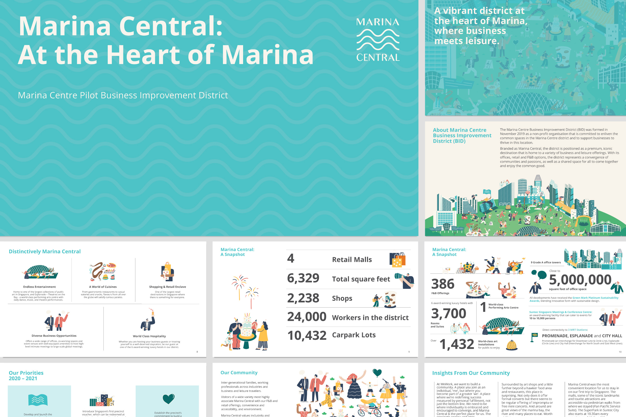
The Marina Centre Business Improvement District (BID) was formed in November 2019 to enliven the common spaces in the area while providing support for its businesses to thrive. The district comprises Marina Square, Millenia Singapore, South Beach, Suntec City and community partner Esplanade.
BLACK was commissioned to develop a district identity for Marina Central to enhance its appeal, while highlighting the unique character and offerings of each development. It would serve to encourage visitors to linger within the district, and broaden spending patterns; draw visitors and attract more to cut through Marina Central en-route to other destinations.
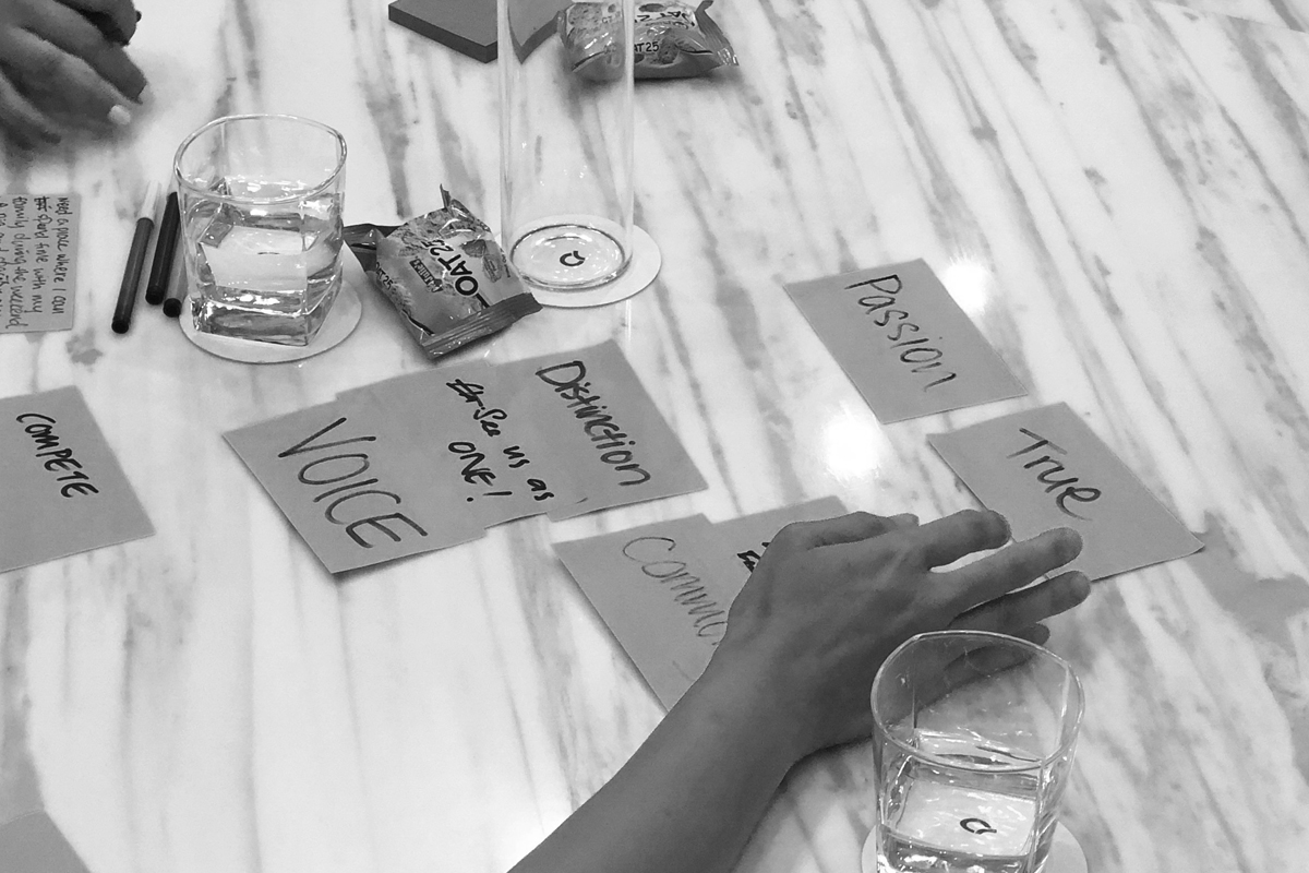
To understand the needs, challenges, and motivations of visitors to the precinct, as well as the objectives and vision of the district’s stakeholders and community partners, we conducted a series of brand and market research sessions with Design Sojourn. This included desktop research, an on-ground survey with visitors, a focus group discussion, workshops and one-on-one interviews with stakeholders and partners.
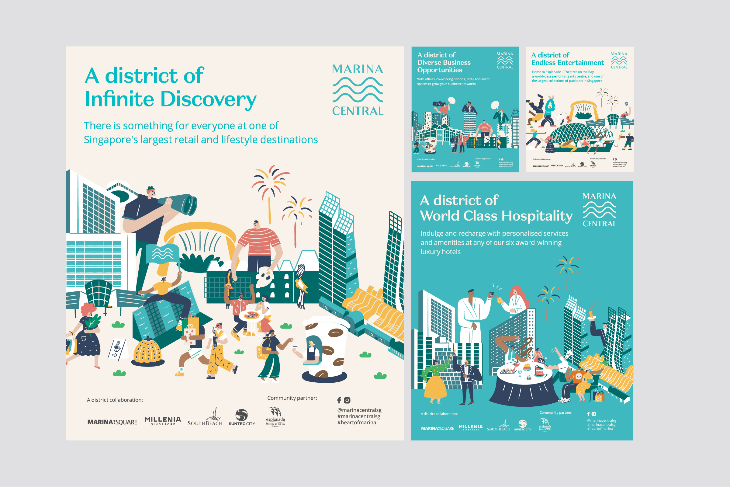
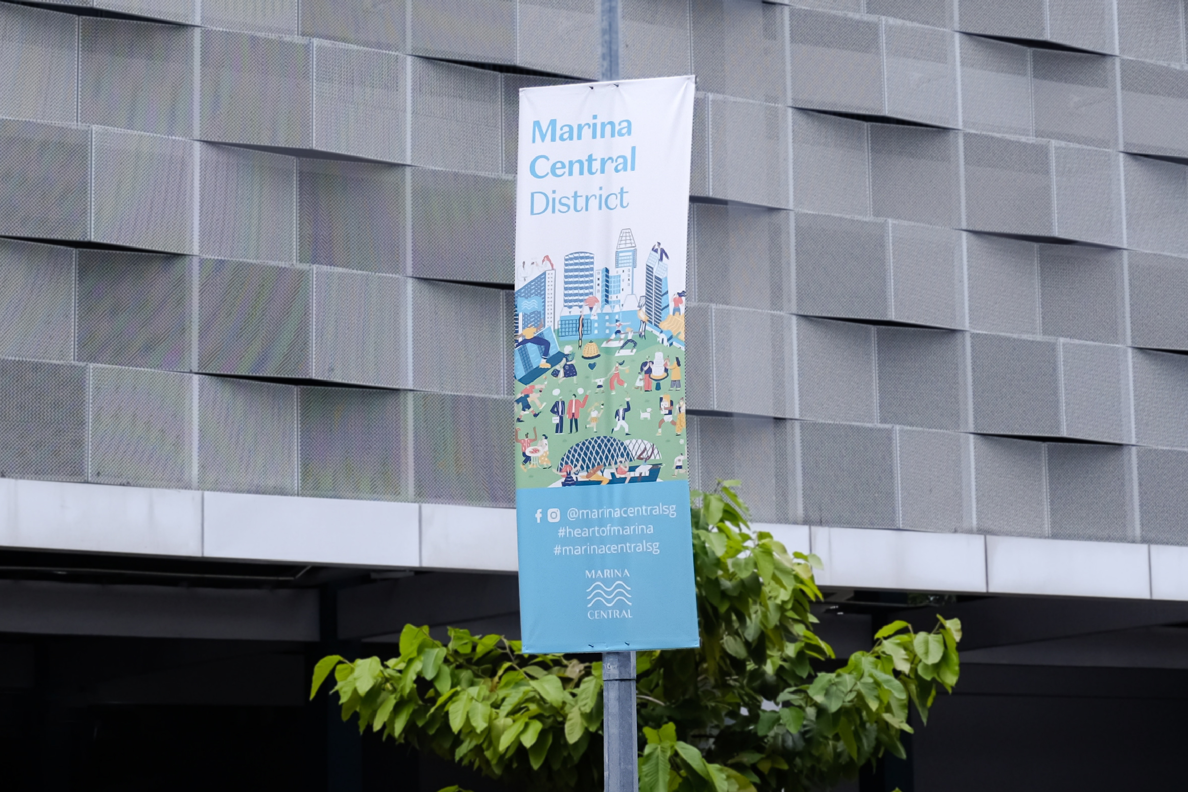
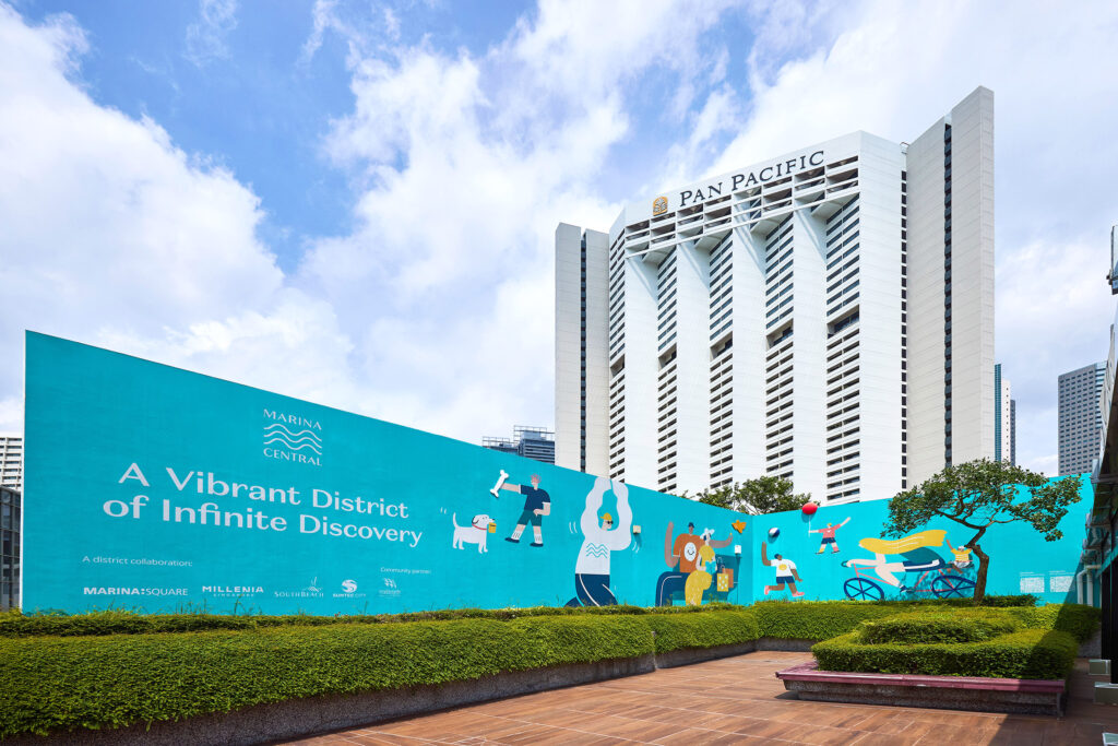
In developing a new name for the district, the word “Marina” was retained for its strong legacy and familiar associations with the waterfront. “Marina Central” was selected to emphasise the precinct’s geographical location, with the aim of further elevating current perceptions of the district. Accompanied by the tagline “A vibrant district at the heart of Marina, where business meets leisure”, it positions the precinct as a significant place where commerce and recreation converge.
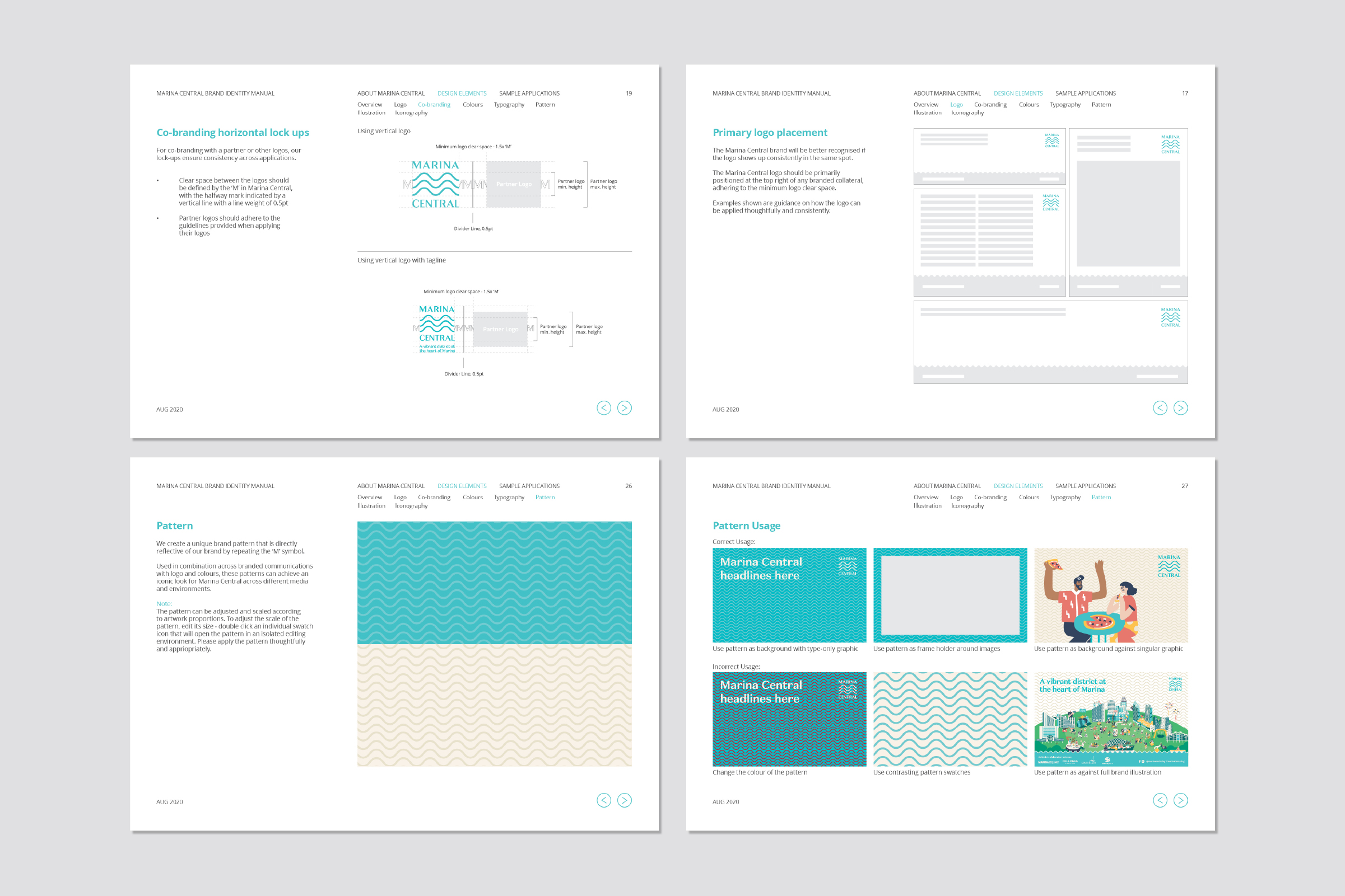
The logo was designed to unify the district while providing distinction from its competitors. Meaningful, simple and timeless, it symbolises the coming together of stakeholders to make waves in the district.
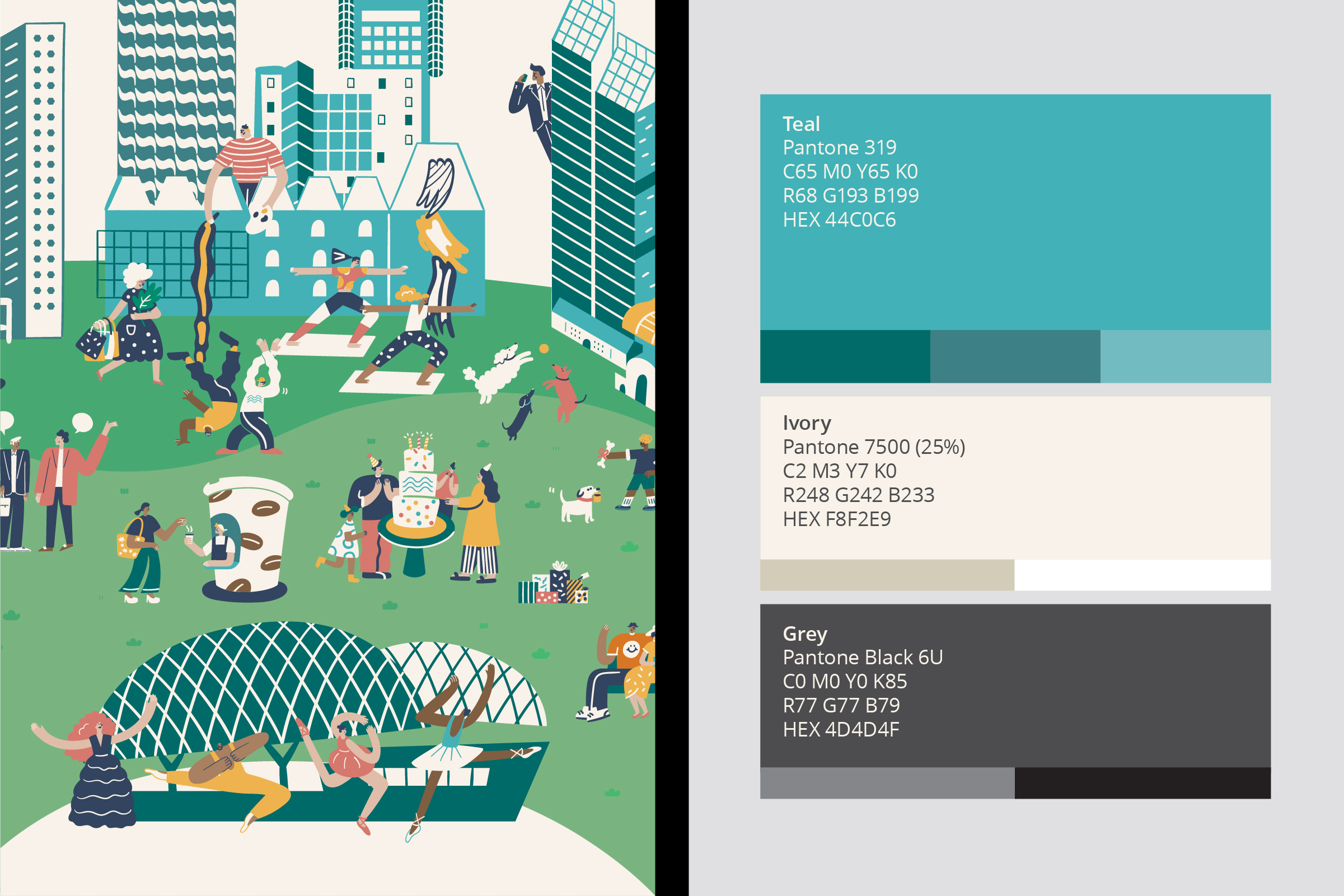
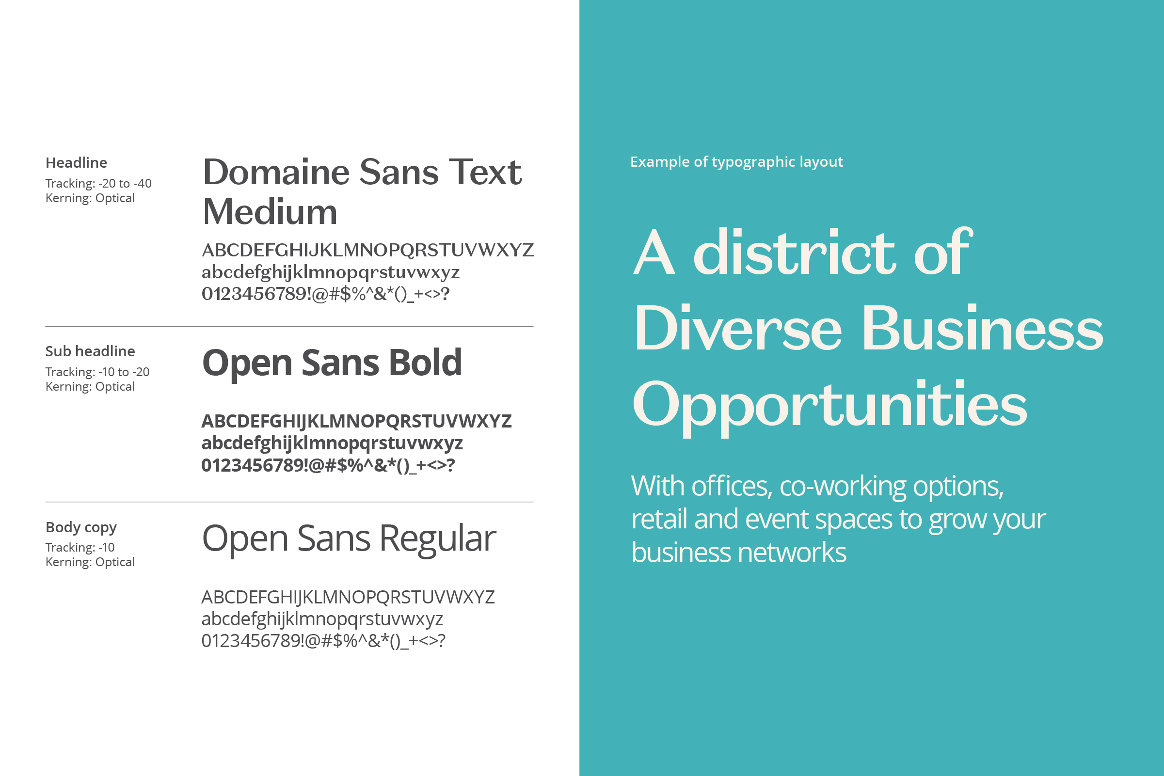
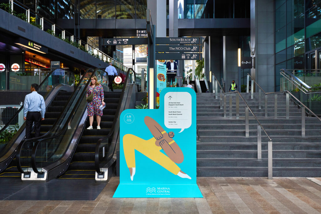
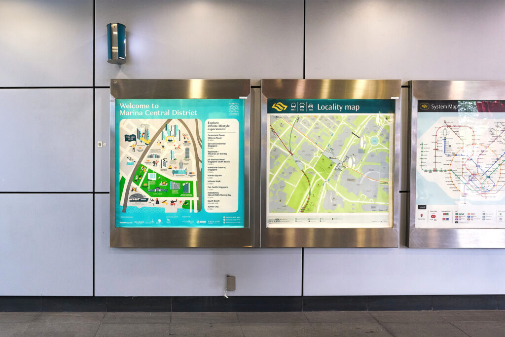
For an iconic look across the brand’s communications, the logo was adapted into a graphic pattern that could be applied in combination with other brand elements. Teal and ivory were selected for the brand’s colour palette to convey refreshment, sophistication, energy, wholeness, and creativity, while providing a visual connection to water. They represent fresh possibilities and connections for Marina Central.
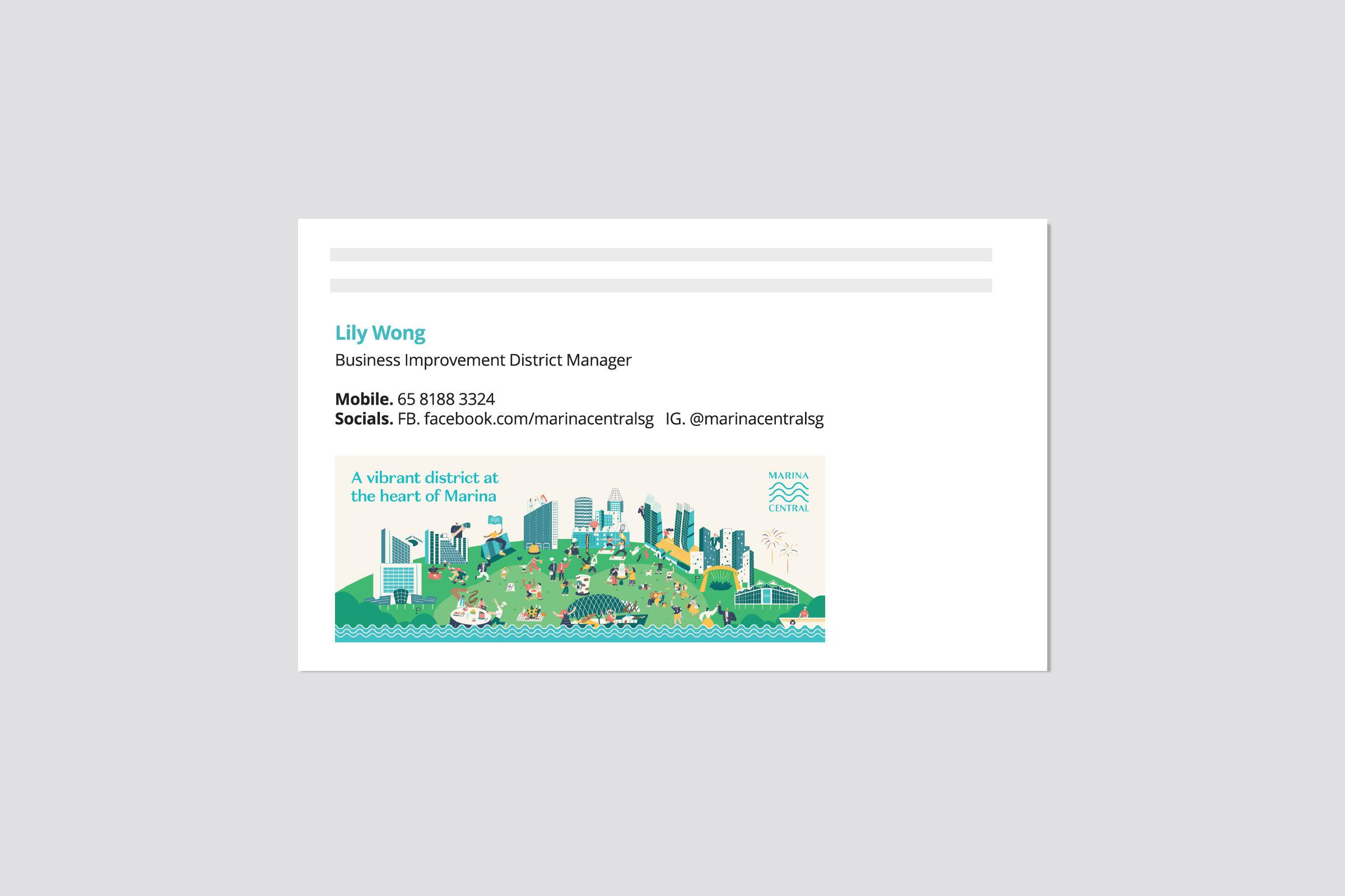
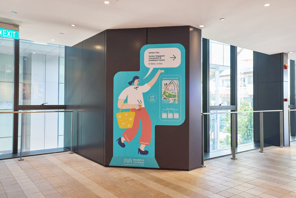
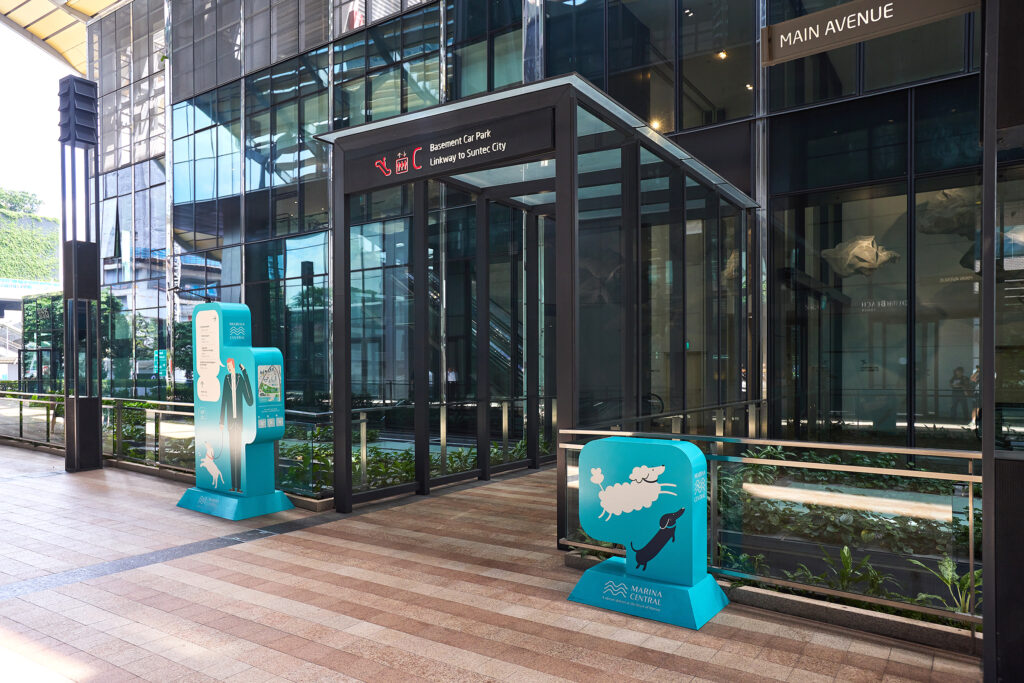
The district’s personality was captured in a series of brand illustrations by 8eyedspud. They embody authenticity, inclusivity and joy, and the energy and activities that the district offers. As the primary medium through which the soul of the district is expressed, they can be used across branding collaterals, and reconfigured to form compositions for various brand touch points such as brand toolkit, digital banners and social media posts.
Read More + Go Back -